Fossil Gen 5E Smartwatch Review: Wearing Quality
Retail Price: $179
We are a participant in the Amazon Services LLC Associates Program, an affiliate advertising program designed to provide a means for us to earn fees and support our channel by linking to Amazon.com and affiliated sites.
Back on Amazon Prime Day, I took the bait and bought the Fossil Gen 5E smartwatch simply due to my curiosity of wanting to know what Google’s Android Wear platform looks like in 2021. It’s been quite a while since I last ran with a legitimate smartwatch running Google’s WearOS (Misfit Vapor). There’s a simple reason why I haven’t been eager to get back onto one; it just wasn’t good. Fortunately this Fossil Gen 5E smartwatch has reinvigorated my interest in the Android wearable space to the point where I’d even say I could survive wearing this while my Galaxy Watch or Apple Watch sits in the drawer.
Galaxy Watch is that you?
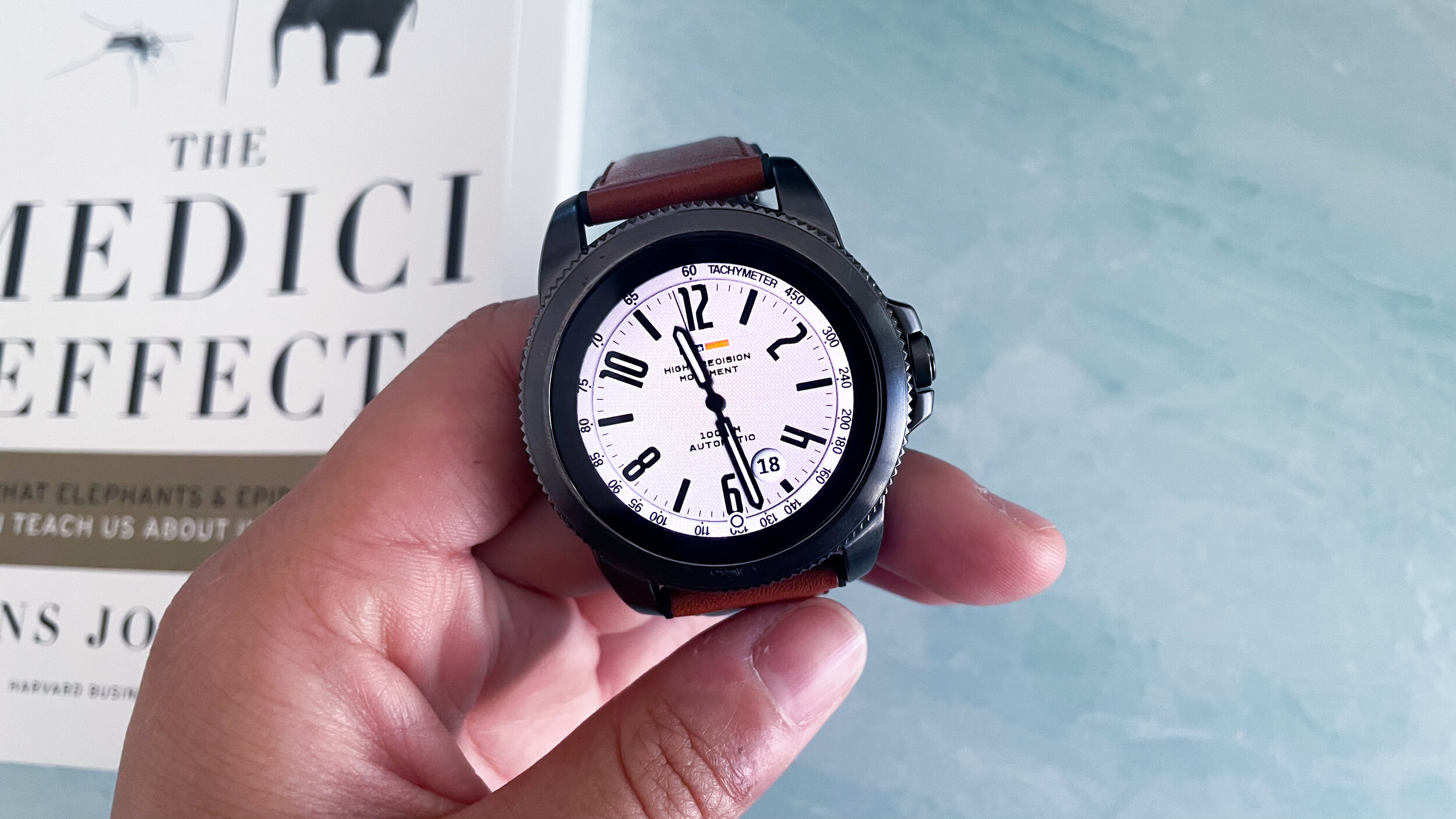
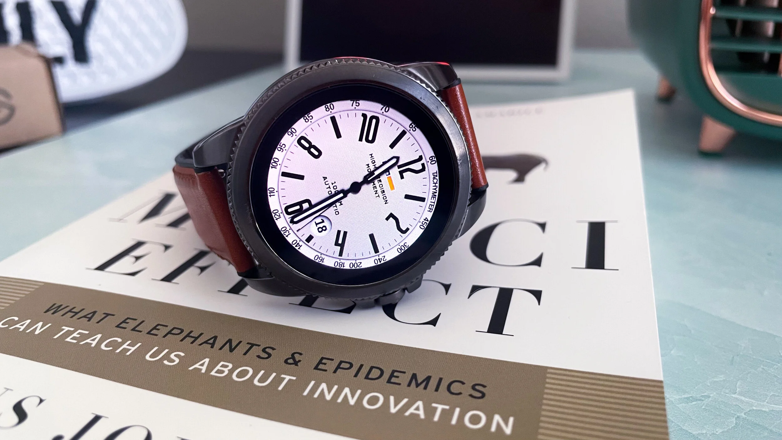
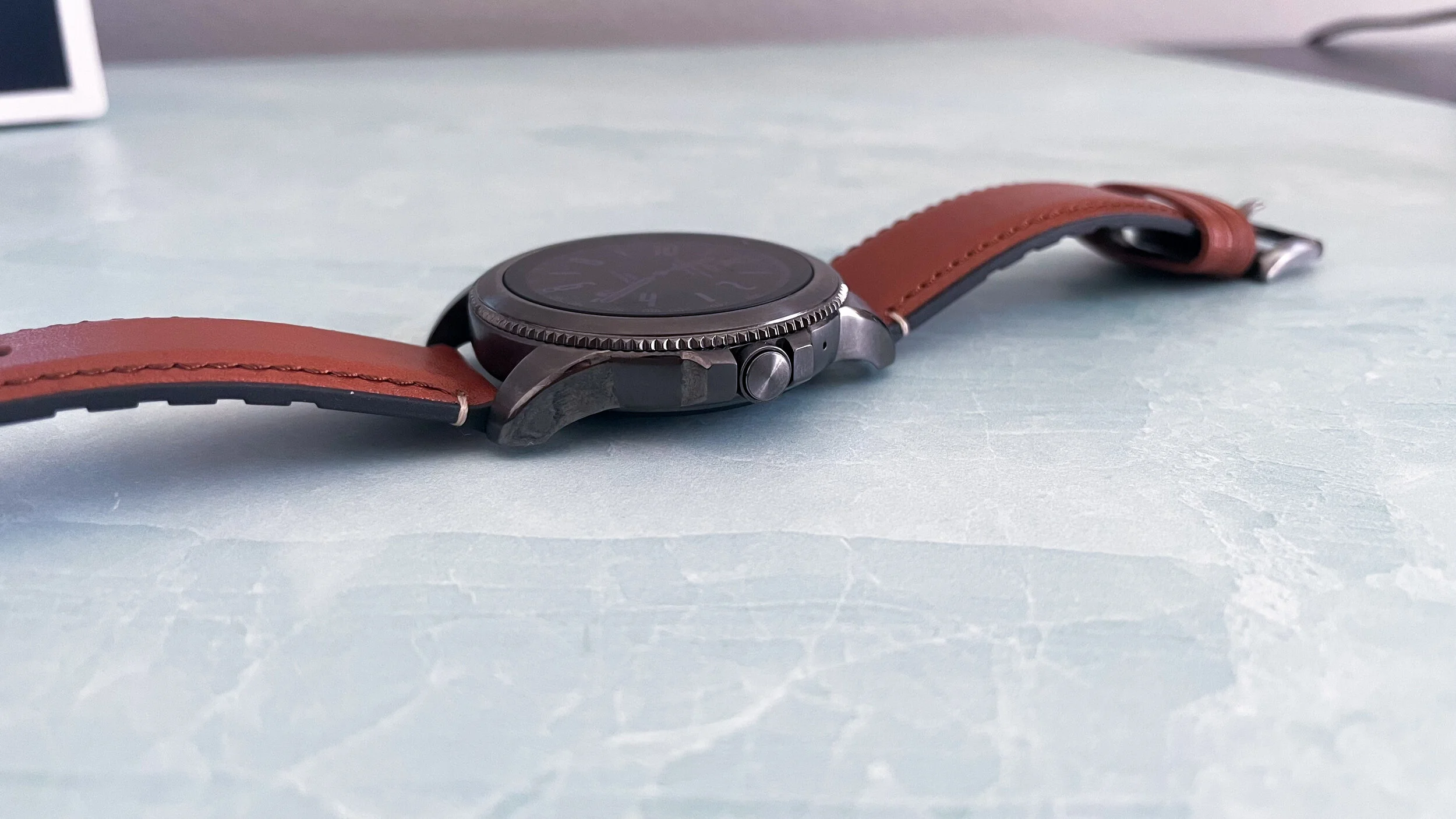
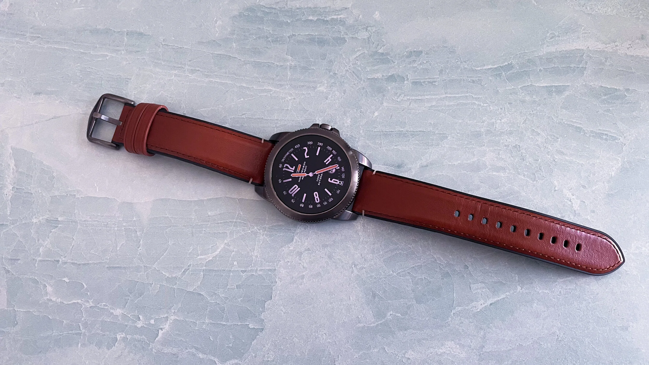
The model I have is the 44mm men’s watch with the brown leather band. The stainless steel case gives off some serious Samsung Galaxy Watch vibes. It even imitates the ridges of the rotating dial except in this case, it deceptively doesn’t rotate! At times I still accidentally glance at the watch only to reach to rotate the dial as I would on the Galaxy Watch. Of course I’m greeted with a stiff no response. It’s eerily similar in look though. Other than that, this watch feels well built and quite sturdy. From a wearable perspective, the stainless steel material may bog your wrist down during a long day. I’ve found myself experiencing wrist fatigue quite often wearing the 5E to the point where I had to remove it off my wrist for periods of time. At 12mm thick, it’s a bulky and heavy timepiece by smartwatch standards. On the right side of the casing lies the only pressable button in the form of a crown. Like many smartwatches, this is how the user navigates the interface by using it as a home button.
Whereas Samsung is a technology company making smartwatches, Fossil is a watch company transitioning to technology for their timepieces. There is a fundamental difference in approach that is present in their respective products.
Matching Attire
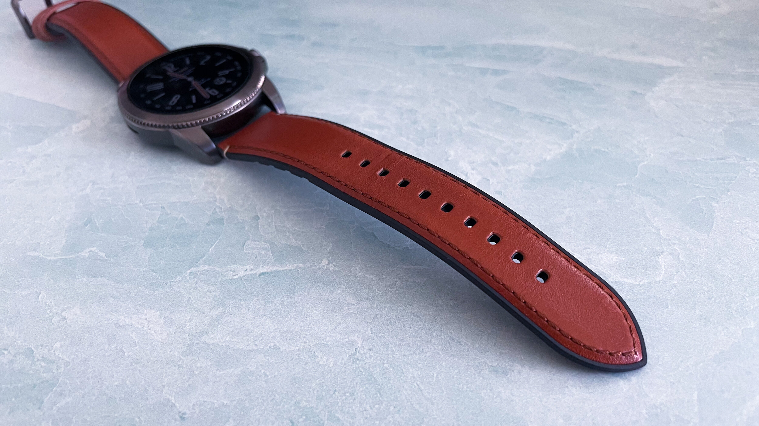
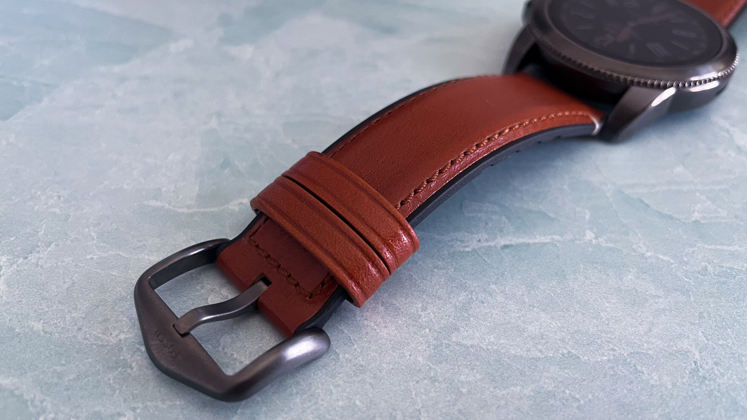
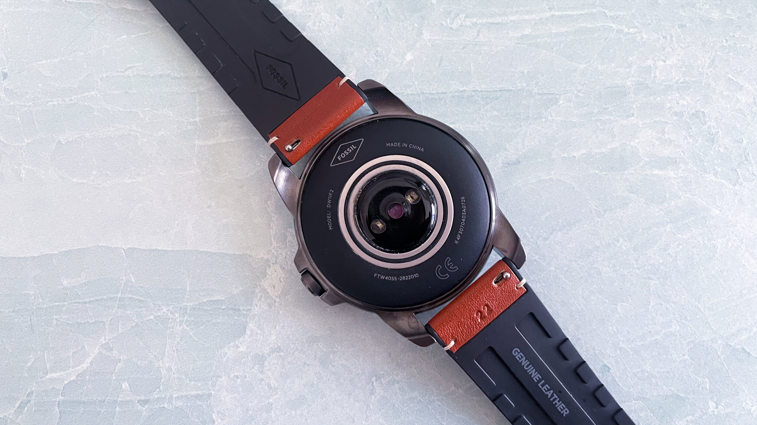
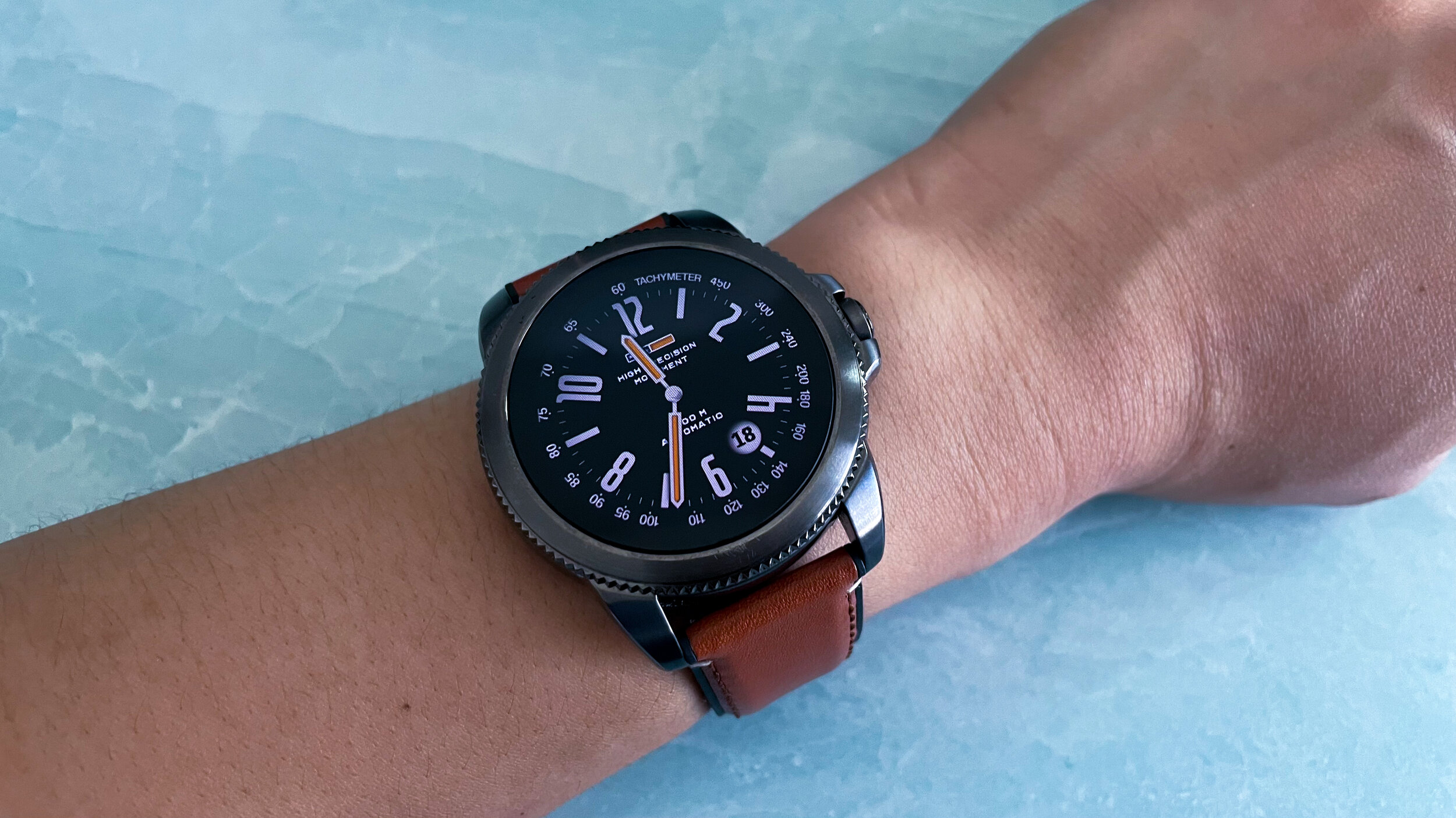
Although I’ve always appreciated the classy look of the Galaxy Watch lineup, I felt as if there was a discourse with the appearance and the actual feel of the material. Sure it looked nice, but the minute you touched the casing, the whole image of a high quality watch dissipates. Although the Fossil 5E looks like a Galaxy Watch, it’s built like a traditional analogue watch. Whereas Samsung is a technology company making smartwatches, Fossil is a watch company transitioning to technology for their timepieces. There is a fundamental difference in approach that is present in their respective products. This watch is great for business attires or anything that requires a bit more of an adult dress code. The accompanying 22mm genuine leather band is of high quality and stitched nicely for a clean look. I have rather thin wrists and I’m still able to securely tighten the 5E with about 4 slots remaining. This one size fits all band should fit just about any human male wrist on the planet. It’s also a quick release mechanism for added convenience.
While there aren’t as many sensors for fitness tracking on the 5E as there are on many competitors out there today, it does have a reliable heart rate tracker. Regardless if it did have more trackers, I’d be hard pressed to recommend this to be worn for any type of physical activity. It’s just too thick and heavy to be worn comfortably during exercise. Fossil claims the watch is swimproof (whatever that means), but I haven’t been able to find IP ratings for the watch. Once again, I honestly think this watch should be eliminated from any physical activity consideration. I personally feel this watch offers a lot of aesthetic presence instead that has clouded the smartwatch industry since the release of the Apple Watch.
Product Specs +
- Qualcomm Snapdragon Wear 3100
- 1 GB Ram
- 4 GB Storage
- Google WearOS
- 1.2 inch Display
- 416x416p
What's the deal with WEARos?
Next let’s talk about WearOS and how it functions in 2021. Like all modern smartwatches, if you swipe down from the watch face, a quick settings menu will populate with the ability to mute the vibrations, change the brightness level, and various other functions we’re accustomed to altering quickly on our phones. Swiping in from the left will bring up the Google Assistant card. This watch has both a speaker and a microphone so it can hear you when you talk to it. That also means you’ll be able to receive and answer phone calls directly from your watch via bluetooth to your phone. I haven’t had any latency issues or microphone problems communicating with people on the other side of the line so it does seem reliable. Swiping in from the right side will take you to your activity tracking functions. And finally, swiping in upwards will bring up any notification cards you have enabled under your settings preferences. Pressing the button will take you to your wearable app drawer.
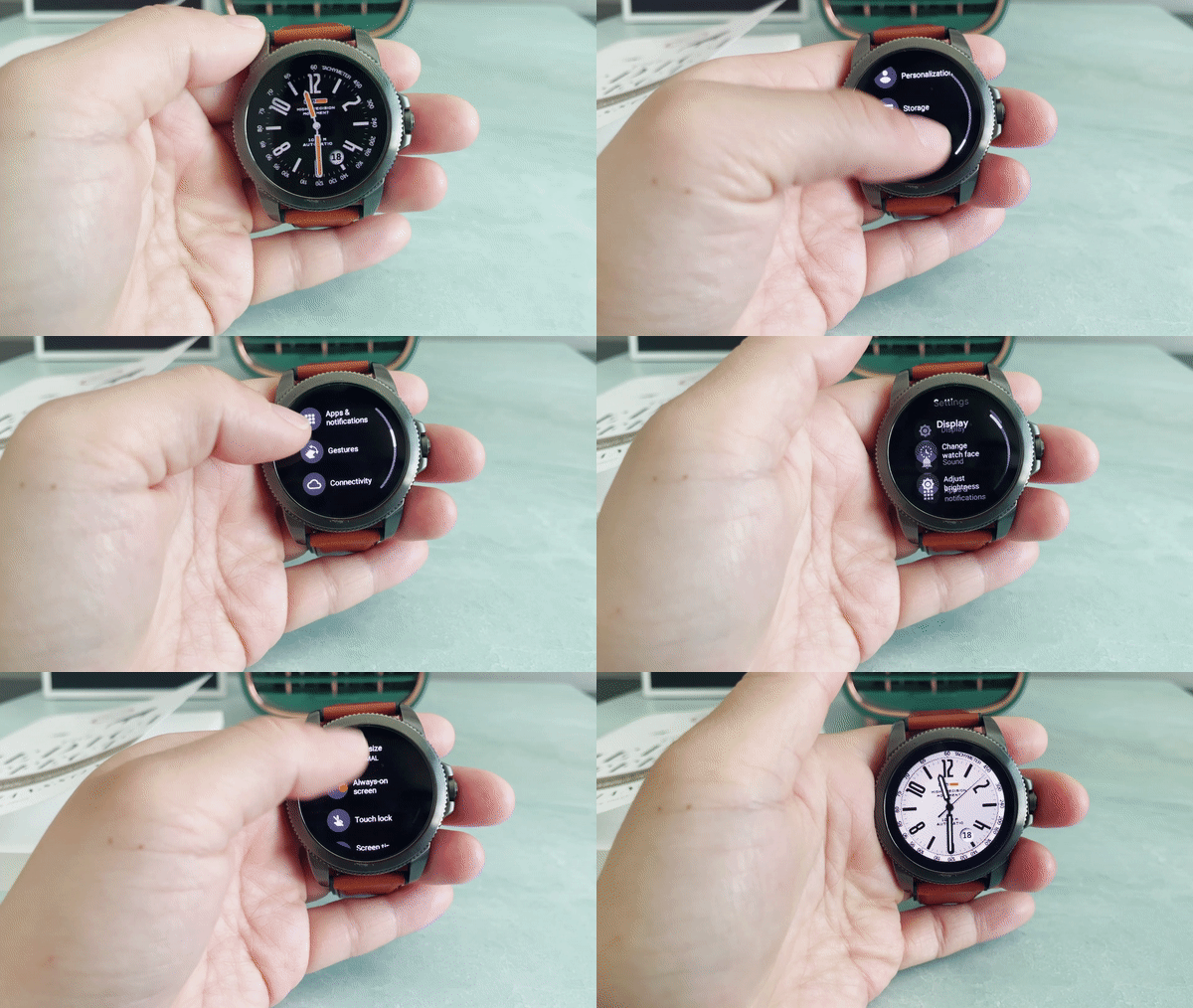
This is honestly a clean experience that looks well optimized on this 1.2 inch 416x416p display. Back in the day, it wasn’t always a given that text would fit properly on round faces using WearOS. I’m glad that we’ve gotten past those horribly spaced cards of last decade. As far as round watch faces go, I genuinely have no qualms over how the information is received and interacted with by the user. This is clean and functional to the eyes. While Fossil didn’t add the latest wearable processor from Qualcomm on here, the Snapdragon Wear 3100 chip hangs on pretty well based on my daily usage. Combine that with 1 GB of ram and 4 GB of storage and that adds up to a pretty standard spec sheet. The performance is acceptable without any major lag from my time with it.
Another thing I’ve come to like are these custom watch faces from individual companies. Fossil has some that I assume are only available pre-loaded on Fossil smartwatches (they do say Fossil on them afterall, duh!). In the early days of smartwatches, I detested the default faces and always resorted to customizing using the Facer app. I’m so glad to see the Facer app actually built into the watch now with access to the watch face store. It’s not only convenient, but also a way to quickly make the watch seem even more valuable in a matter of seconds. In the old days, it was a multi-step process that also required a PC.
Morning to uh..Midday
Where it all comes apart for the Fossil 5E is when it comes to longevity. The 5E just can’t keep up with an average 8 hour workday. I’d estimate that with an average use case I would only net about 8-10 hours off a full charge. That just doesn’t cut it for any kind of wearable in this day and age. It does charge rather quickly on the magnetic charger, but that can’t justify the lack of versatility in user experience thanks to the lackluster battery life. Speaking of the charger, why can’t all smartwatch makers just use a wireless stand/dock and be done with it. No more of these little cradle or dinky magnetic connectors with short USB cables please.
Final Thoughts
Ultimately, I really did want to love a WearOS watch again after so many years away. I came into this with very tame expectations and in a way, the Fossil Gen 5E actually did exceed them. I like the classy look of the watch. I love how intuitive and snappy the WearOS has become and I certainly don’t mind wearing this on my wrist.
However, if we’re talking about an even playing field, there would be no way in tech hallelujah that I’d recommend the Fossil Gen 5E over the Apple Watch SE. They’re competitors yet not competitors at all. While you can use the Fossil watch on both Android and iOS, the same can’t be said for the Apple Watch ecosystem. In essence, Android users still have to settle for less than what a top notch smartwatch can offer. I don’t say that lightly as someone who has traditionally been on Android more than iOS. I don’t claim iPhones are better than Android phones, but I will undoubtedly back the statement that Apple Watches are far and above better options than anything else on the market. That leaves us with this predicament of leftover options. I bought this on sale, but the MSRP is $200+. For that price, I’d wait a bit to see what Samsung does integrating together with Google on their next watch.






Alex
With nearly a decade under his belt running his video production team, and countless hours traveling the country to report on pop culture events during his tenure as a contributor for AXS Examiner, Alex has relied on a lot of gadgets over the years. That still hasn’t satiated his need to get his hands on the newest and greatest the world has to offer!