Microsoft Surface Duo Review: The Great Wall of Duo
Purchase Price: $1,299
We are a participant in the Amazon Services LLC Associates Program, an affiliate advertising program designed to provide a means for us to earn fees and support our channel by linking to Amazon.com and affiliated sites.
Product Specs +
- Dual 5.6 inch displays 1800 x 2700p
- 401 ppi
- AMOLED display
- Snapdragon 855
- 6GB of RAM
- 128 GB of storage
- 3,577 mAH battery
- Android 10
Camera Specs +
Rear Cameras
- 11 MP F/2.0 Main
Selfie Cameras
- Uses rear camera
- 11 MP F/2.0 Main
Video
- Shoots 4k at up to 30 FPS
Have you ever fallen really hard for someone who was extremely physically attractive and seemed like the perfect package for your life only to realize after obtaining their affection that they were extremely flawed and quite honestly annoying to be with?
A Unique Case
That pretty much sums up my relationship with the Microsoft Surface Duo. Let me begin by saying I purchased this phone at full price ($1,299) and got it the day it was available to consumers like you and me; so I’ve had plenty of time to get properly acquainted with the Duo and all of it’s quirks. In many ways, the Surface Duo actually is my perfect phone. It’s not something a majority of the population will ever see in public. It’s rare. It’s different. It’s an eye-catcher. In a sea of iPhone and Samsung candy bars, this is a yacht floating in the middle of a lake by itself.
That’s also where things begin to fall apart for the Duo. While a marvel to look at on a design level, the practicality of this phone fails to address the actual needs of its user. Let’s first dig into the dual 5.6 inch displays, which when combined together becomes an 8.1 inch screen good for a resolution of 1800 x 2700 p. That sounds like a magnificent viewing experience except that it isn't. You should never view things in “full screen” because it’s unusable. Let me explain in-depth as an everyday user of the Duo for just about every imaginable purpose you’d use a smartphone.
Entire words vanishing as the sentence you’re reading approaches The Great Wall of Duo.
While this is one of the best hinges on a folding phone I have used to date, it doubles up as a divider between the two displays. There’s no way around it when you design a phone in a book shape like this. Herein lies the main issue with the Surface Duo that will serve as an overarching nemesis for this hardware: software optimization. No app developer will dedicate any effort to code their software for a form factor unless that form factor is worth their time and money. This is not it.
In just about every app other than Google Play Books, you will lose significant information using both displays together. Entire words vanishing as the sentence you’re reading approaches The Great Wall of Duo. People’s faces deform symmetrically while buttons you need to press are unfortunately placed right in no man’s land, unable to have their user navigate further. That’s what it’s like using this phone with apps enlarged to both displays. This is unfortunate as a user because I did get a glimpse of how this form factor could ultimately be rewarded if an app developer specifically altered their code for a phone like this. This is evident with the beautiful synergy of Google Play Books where The Great Wall of Duo integrates itself as the spine of a physical book, perfectly separating the pages of a novel as if you were traditionally reading. The pages also animate and flip to the next page as you turn the page just like paper would.
Sometimes I had to remind myself that the full screen experience shouldn't deter me from the fact that I actually have two fully functional screens to use in the first place. It’s an illusion for sure. I will mention that these two individual AMOLED screens are in a 3:2 aspect ratio, which once again isn’t properly utilized by apps. This is especially illustrated with Instagram cutting vital information out for IG stories.
In terms of the actual enjoyability of the viewing experience, I think these two AMOLED displays are of great quality. Colors are cleanly reproduced and the images are plenty sharp for my standards. The viewing angles are also worthy of a flagship.
It’s Well Built
Another thing that is absolutely worthy of a flagship price tag is the build quality. This phone just feels special. I’ve had this phone in my pocket everyday since launch and it’s held up better than I would have expected a phone completely sided with glass would hold up. Think about this; there are four surfaces (no pun intended) on this phone and all of them are glass. That’s not something most people can claim they own, yet that’s exactly what this phone has. Gorilla Glass 5 really has kept this phone in rather good shape for something I would have deemed a hazard especially as there are essentially no case makers making cases for this phone’s unique form factor. All you have to rely on is the provided Duo bumper case which is a rubberized silicone that isn’t too intrusive to the functionality nor is it protective of the phone.
This is a well built and beautifully designed phone through and through. More than a month later, I still marvel at how thin this phone is even when folded. It’s legitimately thinner when the two screens are folded together than some phones with only one display without a hinge. Although the phone is shockingly thin, the width makes this difficult to pull in and out of a pant pocket for men. It’s Nintendo 2DS XL territory to me. The design of the Duo will be this device’s lasting impact on gadget history because it doesn’t do anything else well at all.
Due to this clamshell form factor, Microsoft chose not to place a camera sensor on the outside of the clamshell, instead placing the sole 11 MP f/2.0 sensor where you would traditionally classify as a front facing position. This might be blasphemy for me to suggest, but it may have been a better idea for Microsoft not to have included a camera on this phone and extend screen real estate into the bezel instead.
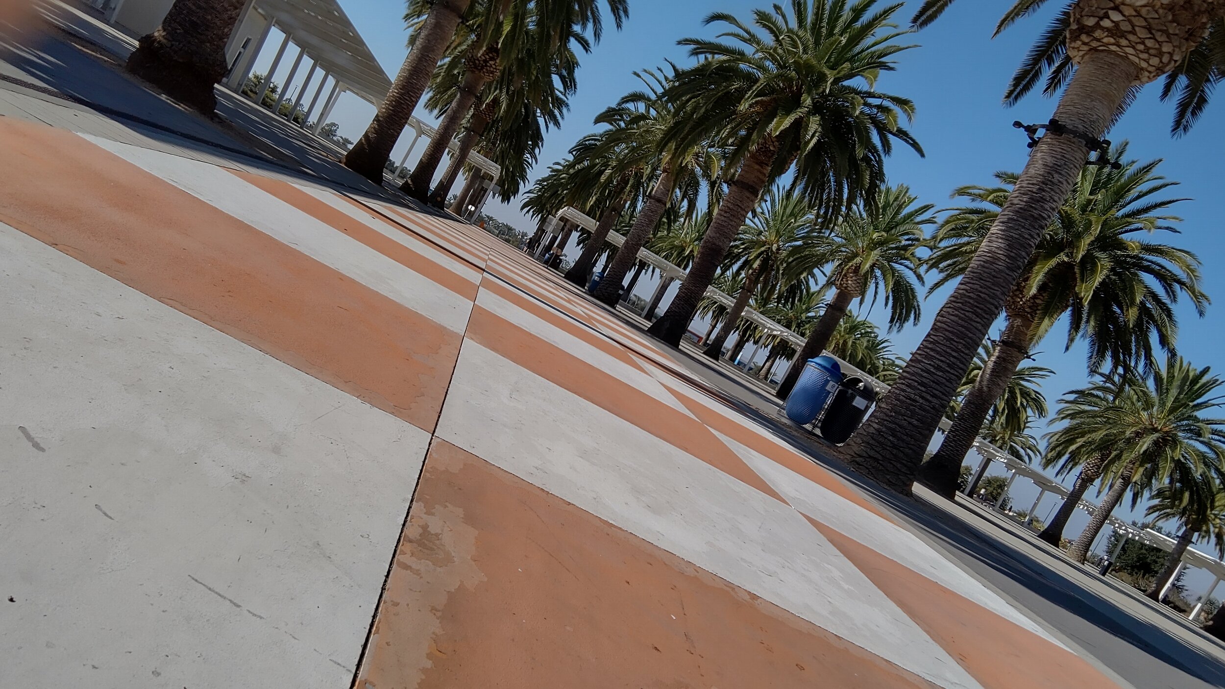
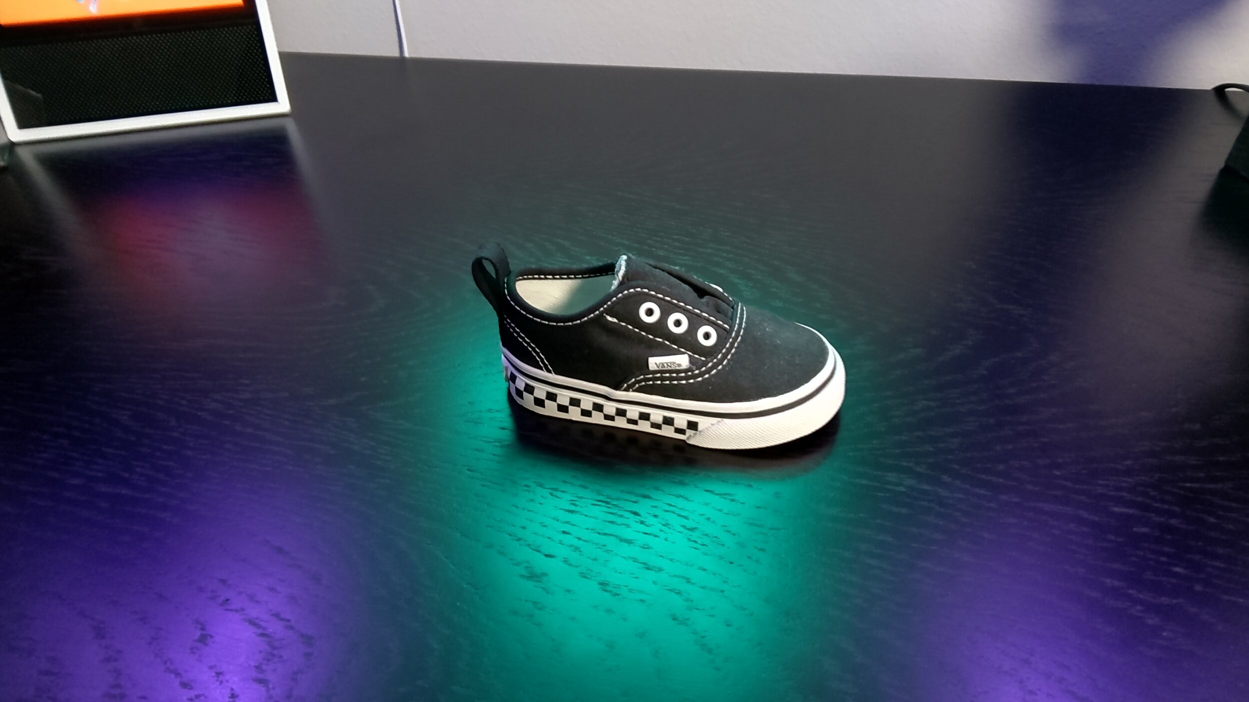
The reason for that is because the camera performance on the Duo is absolute garbage. It’s as if we were thrusted back to 2013 in both quality of the images and the app experience. The shutter is archaic and more often than not gives you a blur of a mess result. Exposure compensation, focus points, dynamic range and just about anything of value to obtaining good images is below average on the Duo. Factor in the frustrating task of folding the phone outwards to shoot it as a rear camera and it’s enough to drive you crazy.
Shot on Microsoft Surface Duo
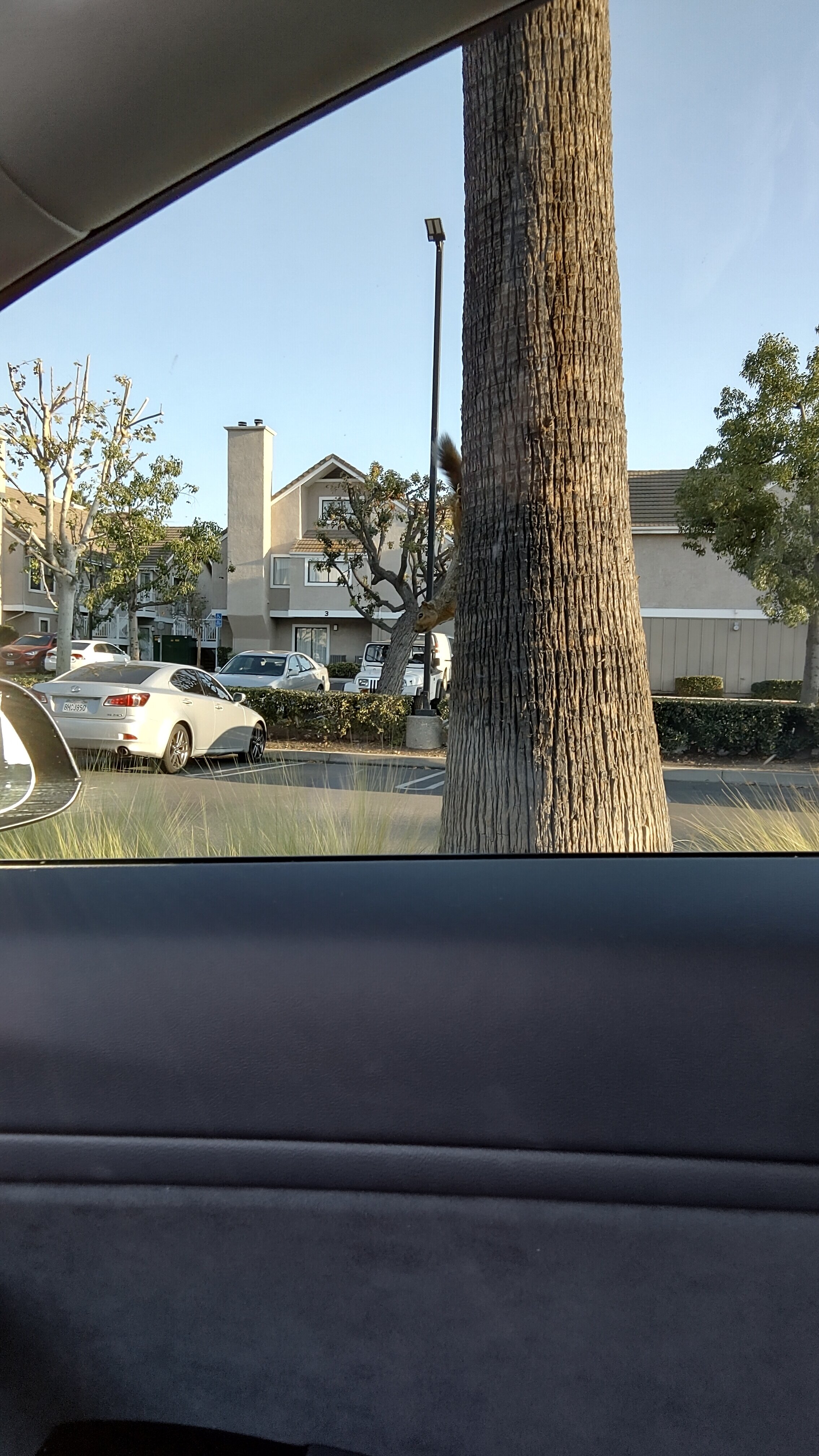
I had an afternoon where I was getting into my car when a big eyed, crazy looking squirrel sat perched on a palm tree locking eyes with me in my driver seat. I wanted badly to capture the moment so I popped out my un-trusty Duo, opened the camera app and flipped the phone expecting the screen without the camera to populate with the viewfinder. It didn’t. I reverted back to populating both screens to try rear shooting once again. Nope. By the fifth attempt the squirrel said “Forget you” and hurried off into oncoming traffic where I hope it didn’t become roadkill. Welcome to the life of a Surface Duo photographer. On the off chance you do get the camera viewfinder to flip on the first try, there is also a noticeable delay. [This has since improved with the latest update *10/20]
I do want to add that this is without a doubt a software issue as is a majority of the issues with this phone. Yet, that can’t be an excuse for a consumer product that is actually on a production line and available for the common folk to purchase.
Speaking of which, last year’s Qualcomm flagship chip, the Snapdragon 855 powers the Surface Duo. While this processor has given me plenty of good memories in 2019, it unfortunately has left me with a sour taste thanks to the Duo. In theory, operating two apps simultaneously side by side sounds like multitasking bliss. In reality, it’s functional hell. The SD855 handles itself admirably with most intensive apps on a single screened phone. Why in the world did I get my hopes up that it could possibly do the same with two intensive apps concurrently with only 6 GB of RAM and the same Adreno 640 GPU we’ve seen on all other SD855 phones? That’s because I tricked my brain into falling in love with the idea of the Duo instead of the logic behind the science.
In theory, operating two apps simultaneously side by side sounds like multitasking bliss. In reality, it’s functional hell.
glimpses of the future
Don’t take this the wrong way though, the Duo can handle most tasks you throw at it as long as the other screen is stationary on your home screen. You can still use this for the most part as the flagship level performance of yesteryear. It just has to work one screen at a time. If that’s the case then what’s the point of buying this in the first place?
One example I like using is playing a mobile RPG game on one display while browsing Reddit for tier lists or watching a YouTube tutorial guide at the same time. Yes you can actually do these combinations and be relatively happy with it for a time, but I can’t say I was ever actually enjoying the experience. For one, the glass that your hand is holding gets uncomfortably hot after a short time playing games or streaming a video. That attributes to the eventual performance throttling and noticeable frame drops in games.
Combine that with the oversensitive auto-rotate sensor and the overly common random black screens that require you to close the lid and you have the recipe for frustration. And who can forget the white screen of death too? Sometimes the phone just decides to give you a heart attack unprovoked and randomly crashes into a white screen for 3-4 minutes before eventually rebooting. It’s happened at least 3 times to me and those are only what I could see in person with the phone in hand.
The 3,577 mAh battery is also one that is frustrating for me considering this phone doesn’t support wireless charging well above $1,000. I’ve gotten into a routine of needing to plug the Duo into its USB-C charging slot twice a day. Twice a day! I’m squeezing maybe 3 hours of screen on time and not even 6 hours off a brick. It is important to note that my app suite and usage may be more extreme than the average user, but the whole point of this phone is that it provides you a second screen to use a second app while your first app does its own thing right? So it’s logical for me to push even harder!
Look it’s not all bad though. The side mounted fingerprint scanner is quite good. I rarely have missed readings. I have well documented my issues with Sony side mounted fingerprint scanners and I haven’t gotten new thumbs and fingers so whatever Microsoft used here works great.
And although I seem to have a lot of ill-memories with the performance of the Duo, there are moments where I am amazed at what I’m doing with this phone. It takes time to find the quirks that suit your workflow and one that I found was folding the first screen 80% back while holding the phone with one hand. Your fingers are lodged between the two glass lids and it provides a stable grasp for you to read whatever it is you’re reading. This is actually the position I use this phone in a majority of the time. I can’t explain why it’s comfortable to me but it absolutely is.
Another thing I’ve grown accustomed to is clicking on a link and having the link open the app or webpage on the empty screen instead of popping on top of your current window like it would on any single panel device. It doesn’t work all the time thanks to software hiccups, but when it does, you do get a glimpse of the future Microsoft envisioned for us. I’m totally for it.
something different is a good thing
I get it. Suckers like me are guinea pigs for a prototype. That’s what the Surface Duo is, but that doesn’t mean you can’t feel satisfied with a product. Take the Samsung Galaxy Z Flip for example. That’s an expensive first generation phone that I loved pulling out of my pocket to use every single time. It wasn’t without its own set of faults, but I can’t say I feel the same way about the Surface Duo. Forget the software experience as this is near unstable for an everyday smartphone. Forget the outdated camera technology. I applaud Microsoft for re-entering the ballgame. The smartphone market is a better place with a player like Microsoft innovating in it. While this phone isn’t the phone that will change the way we use smartphones, it absolutely has a place in the future of smartphones just for the marvelous design alone. However, I just can’t wait to get my sim card out of it.











Alex
With nearly a decade under his belt running his video production team, and countless hours traveling the country to report on pop culture events during his tenure as a contributor for AXS Examiner, Alex has relied on a lot of gadgets over the years. That still hasn’t satiated his need to get his hands on the newest and greatest the world has to offer!