Fitbit Charge 6 Review: So Basically A Pixel Band?
Fitness and health tracking have only gotten more advanced with every year and Fitbit has always been a key player in the space, even a few years after the Google merger. The Charge 6 is their newest fitness tracker and has Fitbit features incorporated with Google tools. In another timeline, this could have been called the Pixel Charge? For our world, is the Charge 6 everything I dreamed of in a fitness tracker? Let’s take a closer look.
Retail Price: $159.95
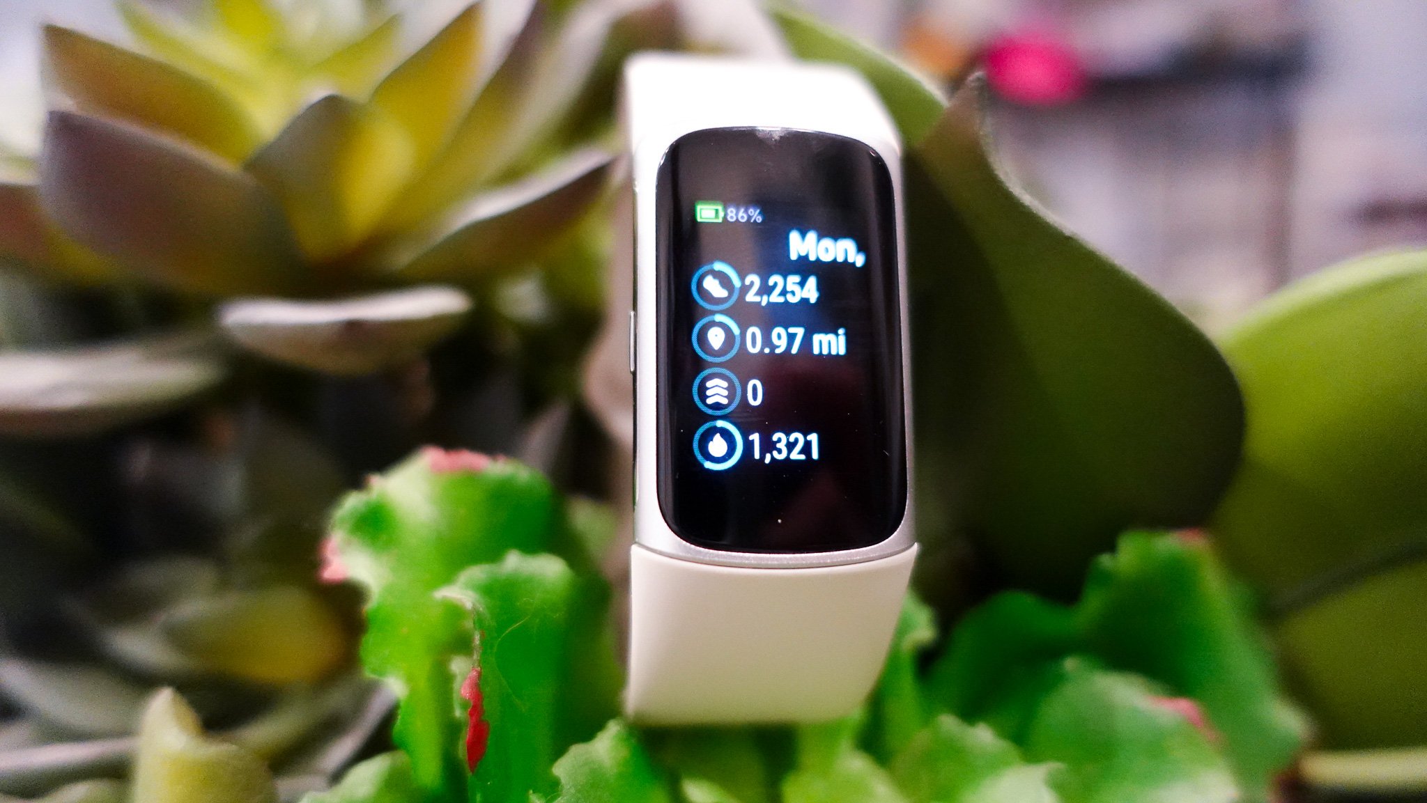
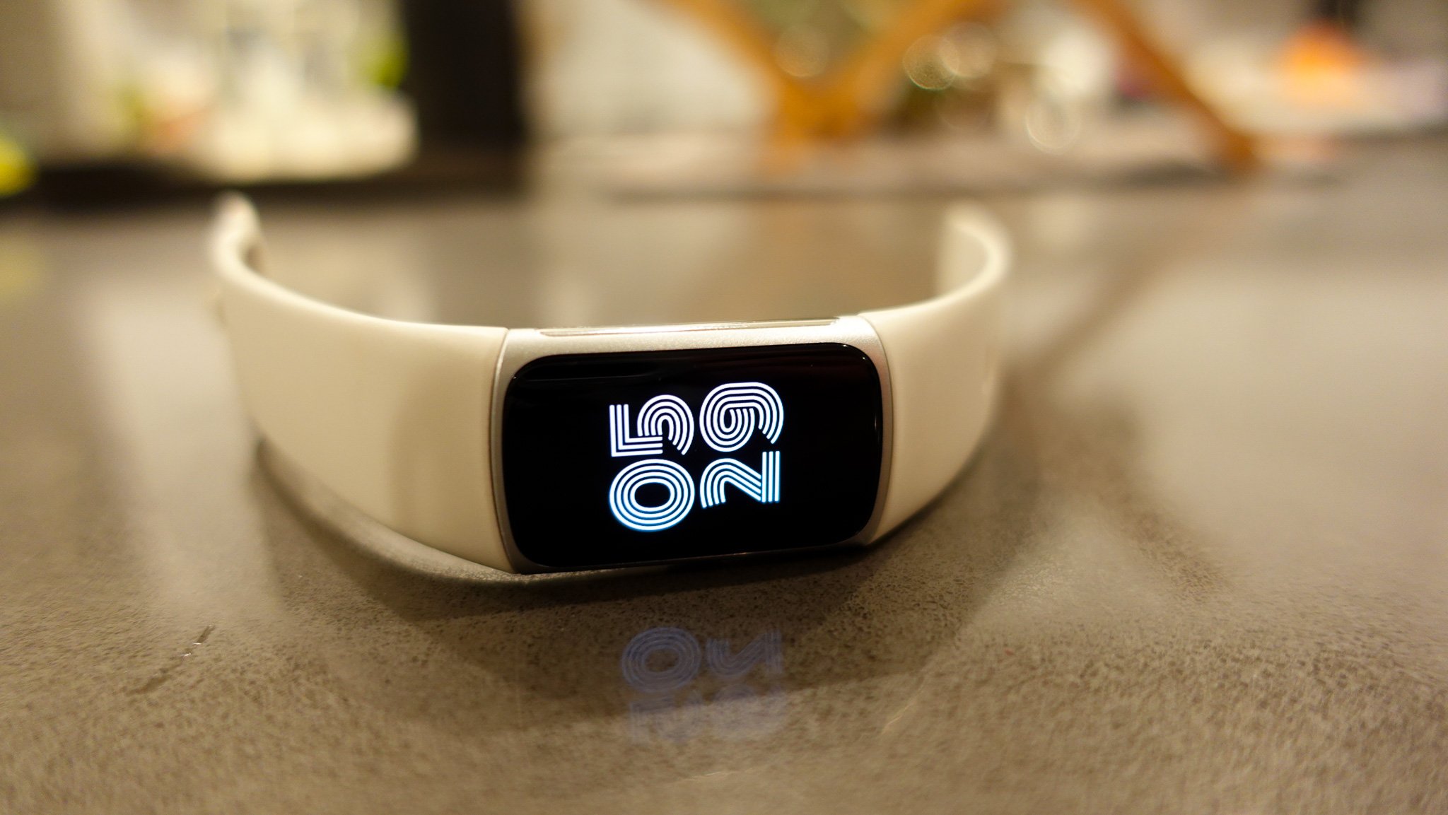
The Fitbit Charge 6 has a sharp AMOLED display
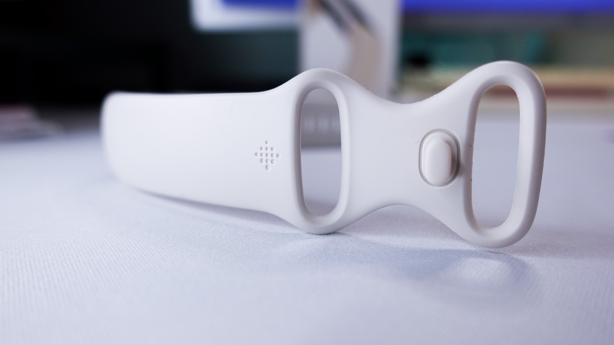
My Fitbit Charge 6 is the porcelain and silver aluminum color way and I love how neutral the tone is. It comes with a silicone band that includes both a small and large variant and the charging cradle that connects via USB-A. I have the same issue on this fitness tracker’s band that I typically do with watches and if you’re prone to having eczema issues due to sensitive skin, be sure to take it off regularly to clean and rinse, especially if you’re going to sweat wearing it. The Charge 6 is constructed from a combination of glass, aluminum, and resin. It has a 1.52” AMOLED touchscreen display. It’s compatible with both iOS and Android. I did not have issues using this tracker with my Apple iPhone 15 Pro.
-
1.45”l x .91”w x .44”h with a 1.52” AMOLED display
Optical heart rate monitor
3-axis acceleroeter
Built-in GPS + GLONASS
SpO2 monitoring
Ambient light sensor
NFC
ECG & EDA scan tracking
Water resistant to 50 meters
Maximum operating altitude: 28,000ft
What does it track?
It’s a small field of view to absorb information, but even then, I personally feel Fitbit restricts the information it pushes too much.
The Charge 6 has a variety of sensors on it. This includes a heart rate monitor and tracking, built-in GPS, SPO2 monitoring, 3-axis accelerometer, temperature skin, blood glucose tracking, sleep and stress management tracking, and NFC. Essentially, Fitbit packed in all the features they could into the small body of the Charge 6. And while I have no qualms with the actual tracking sensors themselves, some of the software and UI layouts just felt clunky for me to use during my time with the Charge 6.
My first example of this is the SmartTrack feature. This is one of Fitbit’s trademarks and it’s supposed to be able to recognize and record workouts automatically even if you forget to manually start tracking. I strength train at a gym twice a week and usually do some form of cardio for at least another few days a week. There are many times in which I have forgotten to start tracking my workout for one reason or another and for the entire time that I’ve used this device, I did not notice the SmartTrack feature notify me at all that it was activating. If you’re someone who enjoys logging their workouts and reviewing their stats later in-app, I would not recommend relying on the SmartTrack feature to remind you to start tracking.
Another complaint I had was with the UI of the Charge 6 and how it presented information from on the tracker to the mobile device app. An example of this was the menstrual tracking feature. This functionality obviously doesn’t pertain to everyone, but since Fitbit advertised being able to help track cycle trends, I wanted to see how this would play into the Charge 6 and the answer was that it’s very basic. Sure you can log symptoms and track your menstrual cycle in the app pretty easily, but the view of what it reflects on the Charge 6 is practically nothing. It kind of updates to tell you how many days until your cycle begins, but even then the text looks funky and you’re better off looking at the app itself (or any other cycle tracking app you use) for additional information. At best, I would say the Charge 6 can be used for at a glance notifications when it comes to overall metrics, but if you want to take a deeper dive, you absolutely need to open the Fitbit app on your phone. It’s a small field of view to absorb information, but even then, I personally feel Fitbit restricts the information it pushes too much.
A bonus to the Fitbit x Google merger is that you get all the Google notifications natively onto the device in addition to call and text notifications. This includes Gmail, Google Maps, and YouTube Music. The display of the Charge 6 makes reading things like email notifications a little awkward because of its oval-shaped size but does the job well enough to pass you information when you need it. Since it’s a fitness tracker and less so a smartwatch, you won’t be able to access as many notifications from other apps as you might on a watch. However, as I mentioned earlier, the Charge 6 does have NFC which is great for making mobile payments via Google Wallet. It’s seamless and is a must-have in my book. This added benefit makes this a much more viable smartwatch replacement than a lot of other fitness bands out on the market.
watch-like features in a fitness tracker
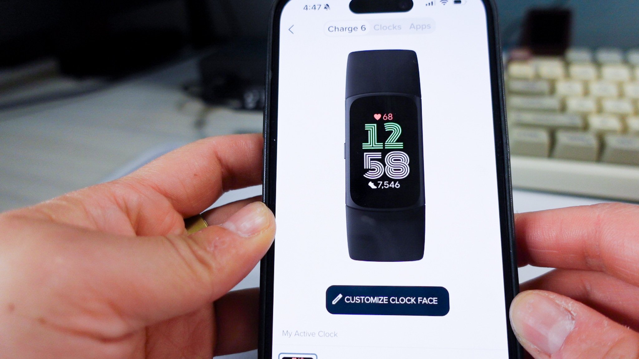
When it comes to the display though, I am impressed with how colorful and responsive the Charge 6 is. It’s possible to even set the display to be always on, if you so choose. Users can customize watch faces and metrics they want to see on the device. So while it is cheaper and less powerful than a Fitbit smartwatch, you really aren’t missing that many features that will make you regret not choosing a full-blown watch instead of this fitness band. You unfortunately cannot upload a photo to use as a watch face, but there are at least a few dozen “watches” you can choose from in the Fitbit app. There’s one button on the Charge 6 and it’s to the left hand side of the display that you use to access the menu. It’s a simple and straightforward device with a minimal learning curve.
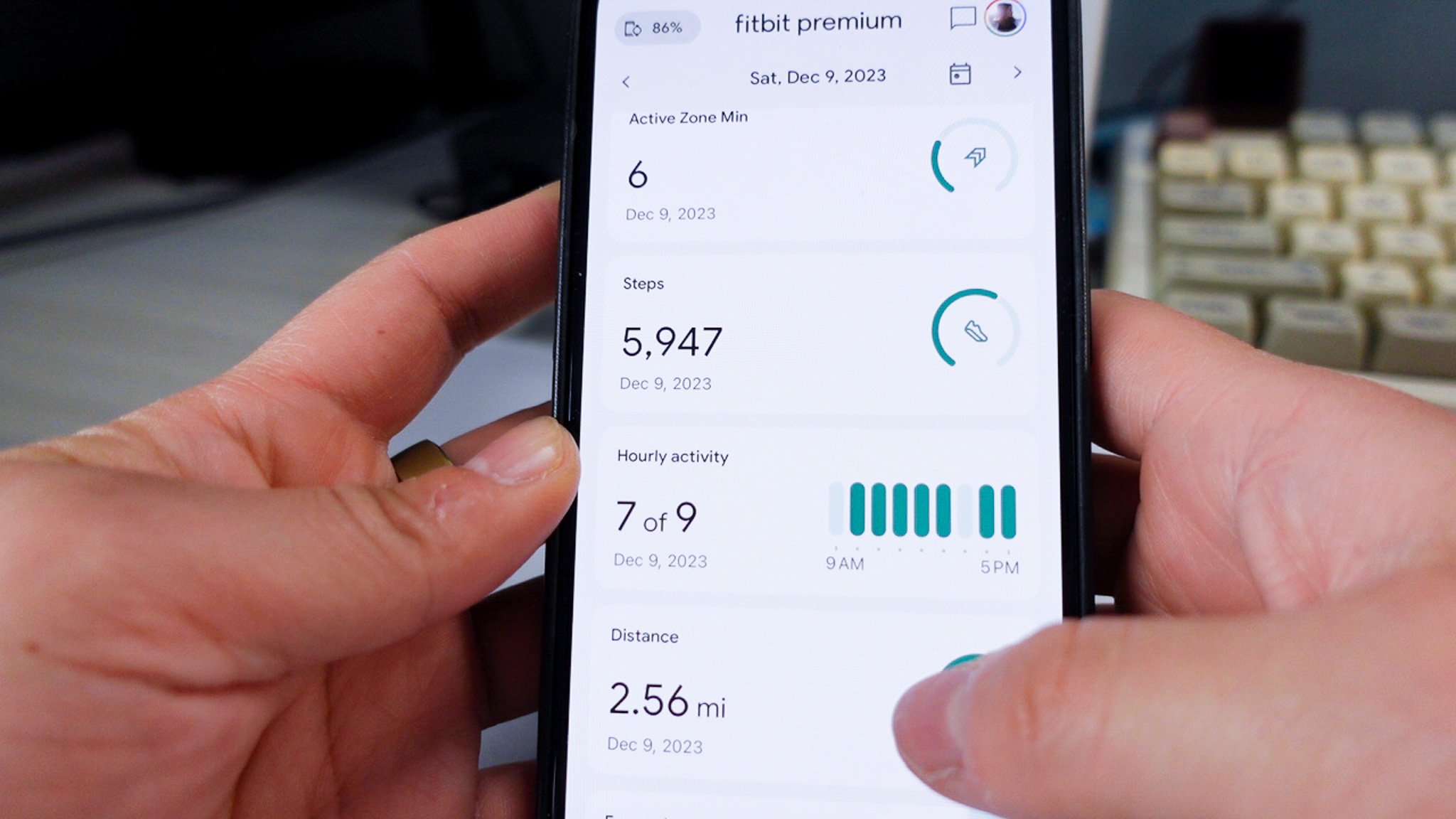
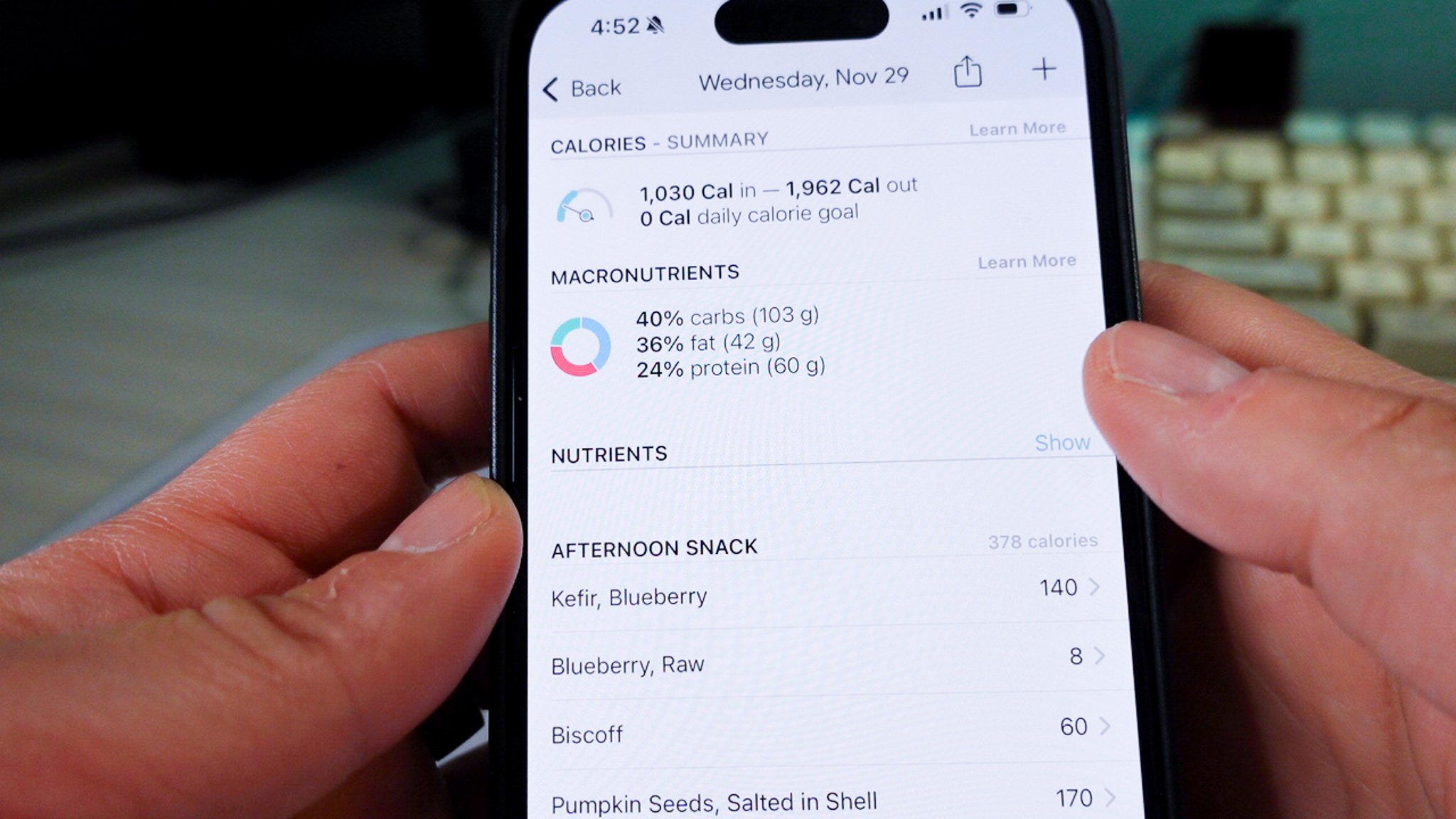
The Fitbit ecosystem is pretty well built out at this point and the in-app experience is as you’d expect with any other Fitbit device. If you wear the tracker to sleep, the Charge 6 can monitor stress and sleep tracking. Since I don’t like wearing anything on my wrist to sleep, I did not use these features on the Charge 6 regularly, but it seems to work as well as the Google Pixel Watch 2 in how it measures your sleep. I did try testing out the nutrition and food tracking feature and while it did feel tiresome sometimes to log everything and did not have as large of a food library as other dedicated nutrition apps, it was nice to see all of your health and wellness charts located in one place.
The Fitbit Charge 6 charging cradle connects to the tracker and plugs in to charge via USB-A
As expected on a band, the battery life on the Charge 6 is very impressive. Fitbit says the device can last up to 7 days and despite my notifications and active use of it, this tracker lives up to expectations. Charging the tracker is also easy through the cradle and can charge to 100% in about two hours. While I found myself charging the tracker about once a week, note that if you keep the always-on setting or use SPO2 features, Fitbit does say you may have to charge more frequently. At worst it’s a few days before needing the plug.
should you buy it?
Overall, I think the package that Fitbit offers in the Charge 6 is competitive. The device is easy to set up and use and if you want to use the tracker everyday to look at your at a glance metrics (ie steps, heart rate, etc), the Charge 6 is fantastic for it. While some features were a little clunky and the display made notifications sometimes awkward looking, I can see the appeal in the package the Charge 6 offers. While I’m not in love with the Fitbit app, it does a good enough job at giving a holistic view of a user’s health and wellness goals. I’m looking forward to seeing where the next evolution of wearables takes us next.
We are a participant in the Amazon Services LLC Associates Program, an affiliate advertising program designed to provide a means for us to earn fees and support our channel by linking to Amazon.com and affiliated sites.
