Hands On with the Nothing Phone (1)
Purchase Price: $549.00
We are a participant in the Amazon Services LLC Associates Program, an affiliate advertising program designed to provide a means for us to earn fees and support our channel by linking to Amazon.com and affiliated sites.
I haven’t really been too excited about a new smartphone release for a couple of years now. There used to be phones released that would intrigue me because of the flagship killer element they provided. Then there were devices where the form factor uniqueness of of something like the Blackberry’s or the Microsoft Surface Duo would instantly find me drawn to them. I can honestly say that nothing has really made me get out of bed in the morning to rush to pre-order in quite a long time. That is until the Nothing Phone (1) came out. I couldn’t pre-order the phone in the USA, but it definitely had both the form factor excitement as well as a potential flagship killer element to it thanks to it being an indirect spawn from the original flagship killing company. Is the uniqueness of the phone enough to hold over my intrigue after a week with Nothing’s first phone?
Nothing but specs
Spec-wise, the Nothing phone is nothing to jump out of your chair for. Okay, no more Nothing puns (as tempting as it might be). Powered by a Qualcomm Snapdragon 778G+ 5G chipset, this phone isn’t weak on resources either. With 8 GB of ram and 128 GB of storage backing that SoC, the Nothing Phone is exactly what a top mid-tier phone would expect to have for specs. Running on top of a skinned version of Android 12, this new brand has stayed pretty true to stock Android through and through. This uses a skin (not very creatively) named Nothing OS, that as far as I can see, has only minor navigational alterations to a stock Android 12 operation. A 4,500 mAh battery keeps the phone alive in which it also needs to supply juice to power on an insanely cool LED backlight pattern of the Nothing logo. I don’t think the unnecessary aesthetic add-on should affect battery life too much, but check back for the results in the full review. I do already like the fact that this has 15W wireless QI charging which even the Google Pixel 6a that I just reviewed omitted.
Rounding out the rest of the spec sheet, Nothing has popped in a 50 MP f/1.9 wide lens alongside a 50 MP f/2.2 ultrawide lens for a dual 50 MP setup. A 16 MP f/2.5 lens fills the selfie camera slot as a hole punch on the Gorilla Glass 5 display. Speaking of display, we are looking at a 6.55 inch 1080 x 2400p OLED panel with a 20:9 aspect ratio. With a 120 hz refresh rate and a PPI count of 402, this OLED panel is nothing to sneeze at. There’s also an under display fingerprint scanner hidden there. The numbers do look pretty solid for a 2022 smartphone, so I’m looking forward to seeing actual real life performance results using this as an everyday driver.
Different Vibe
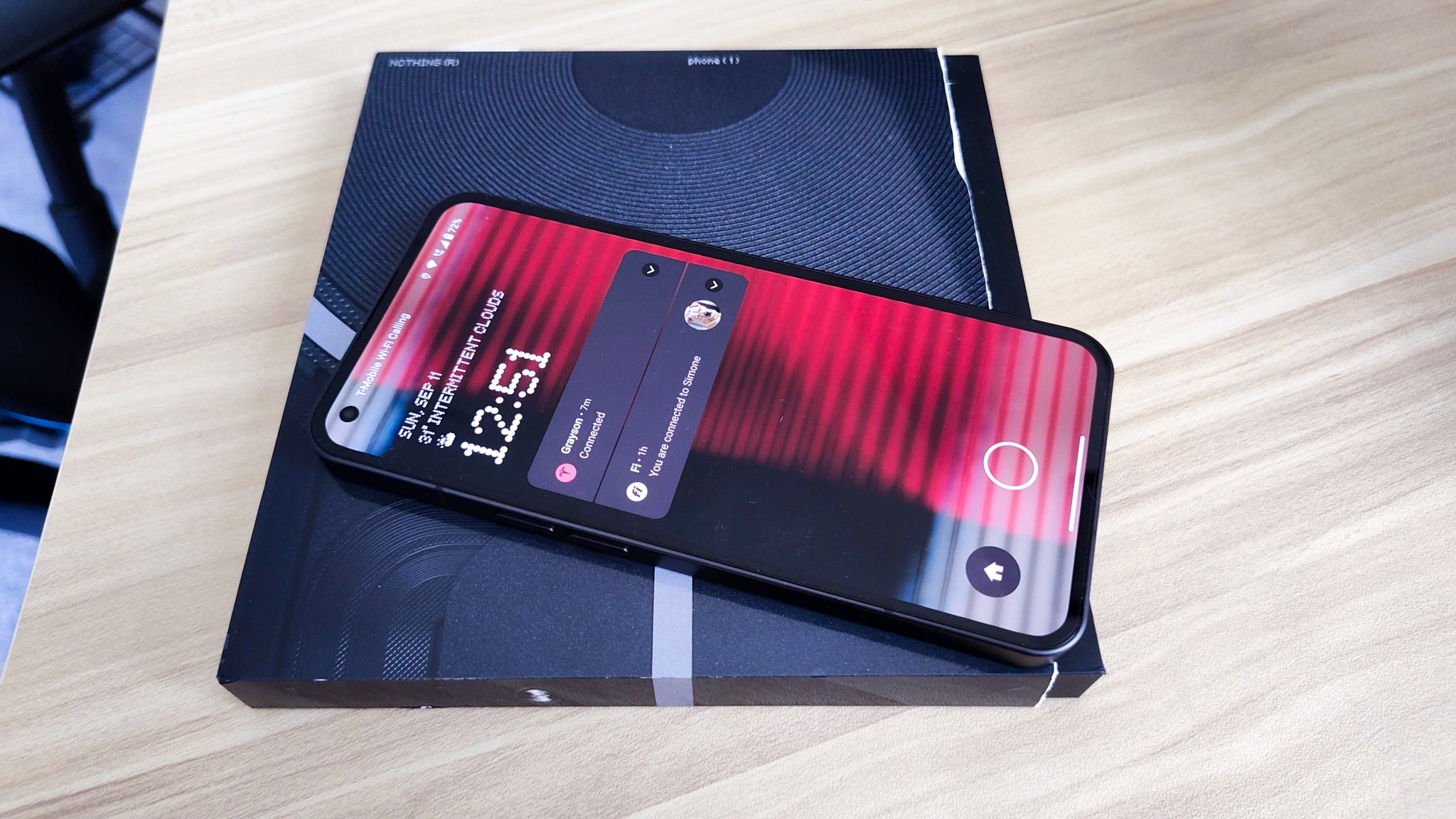
The Nothing phone unboxing experience is nothing (I can’t help it) like I can remember in recent memory. The box it comes with is a one time only open ordeal. You tear the wrap around the width of the box and it strips off a section of the plastic that slides off, never to return back on. Once you unbox the box, the box can’t close again. The package also resembles a CD cover or a mini vinyl case more than a box that a modern smartphone would come in. Two narrow slits house the phone, paperwork, and the USB-C cable. Of course, like most OEM’s now, a power brick is omitted. It wouldn’t have fit in this packaging anyway. This is definitely a unique box that gives off a significantly different vibe than what we’ve been accustomed to opening in the tech world.
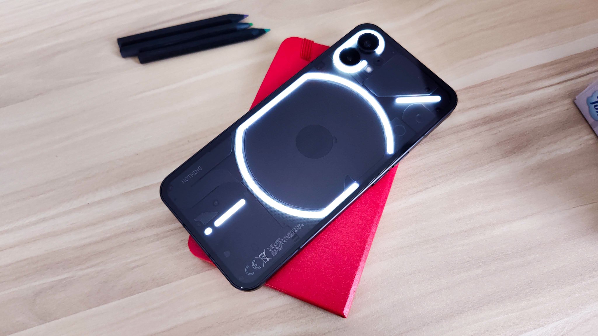
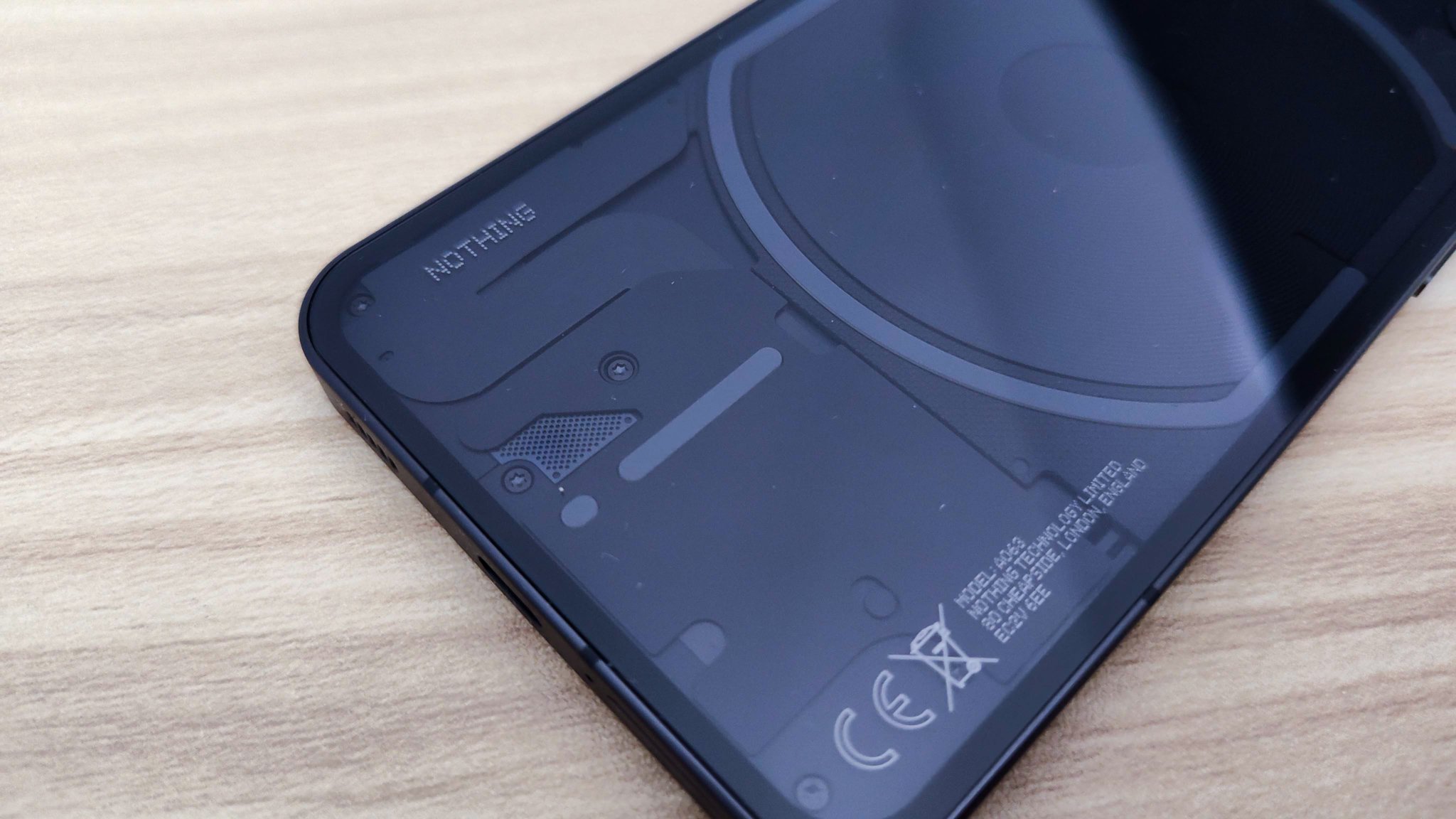
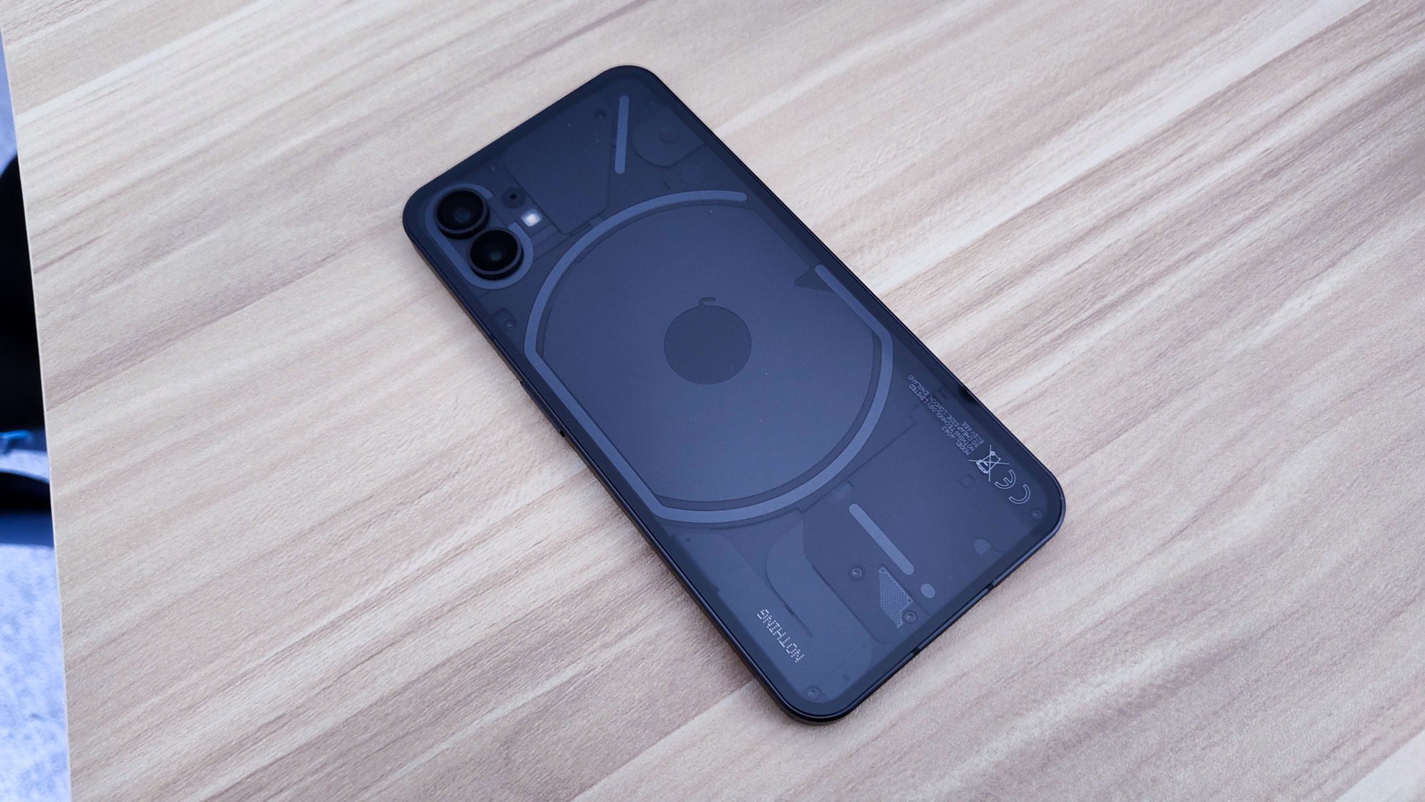
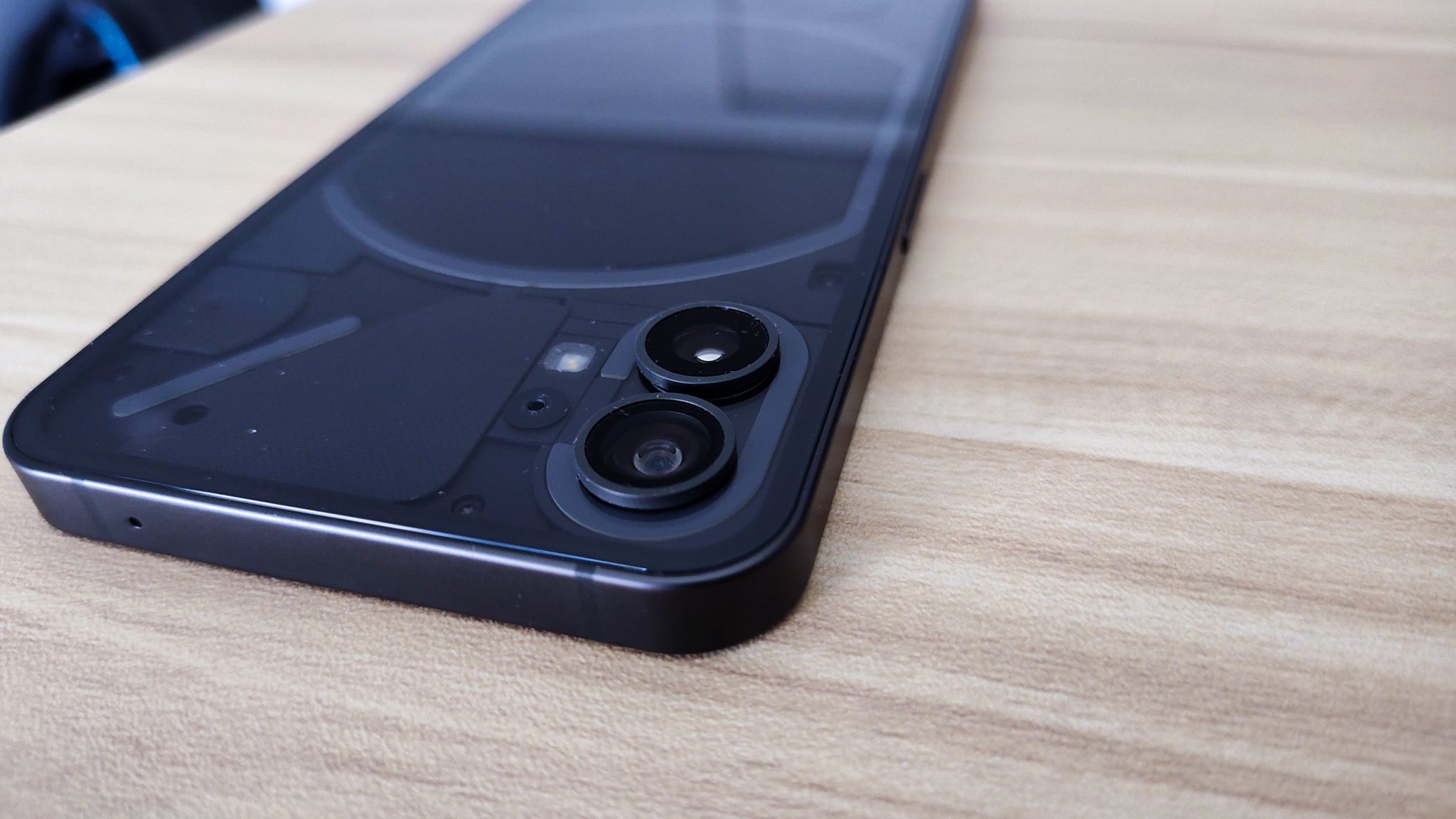
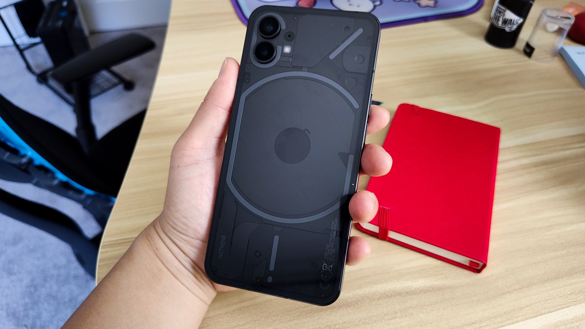
The other new vibe going on is of course the rear side of the Nothing Phone (1). Protected by a glass back, the LED light in the Nothing logo, named the Glyph, is nothing short of magnificent to look at. Talk about a design choice to help distinguish a new brand. There are only a few things you can program the lights to do, mainly as a notifications indicator, but anytime I can get my hands on a phone with a translucent back, I won’t complain. There is something really awesome about being able to see the insides of your tech item. It makes you really appreciate the design aspects that go into it, especially one as clean looking as the Nothing Phone (1). I bought the black color for an extremely industrialized appearance. I really like how this phone looks from the back. Nothing also sells a white variant of this phone that also looks quite slick.
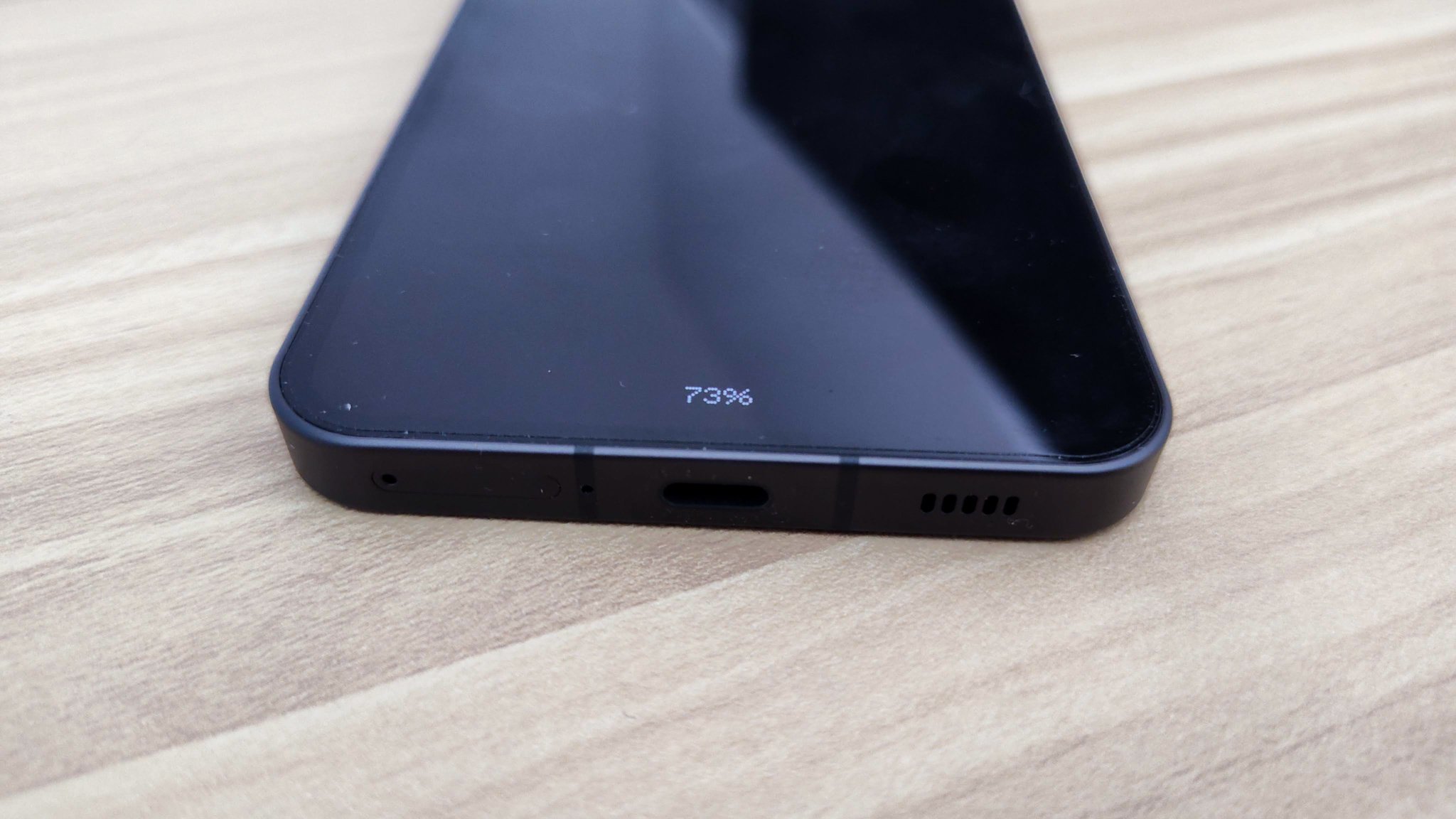
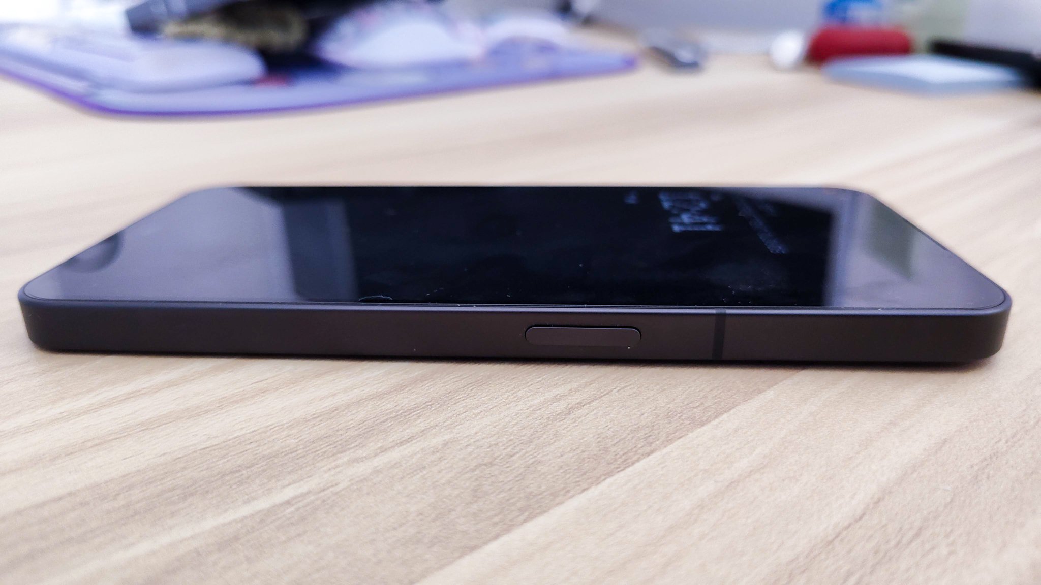
When you also account for the fact that this phone has IP53 certification for water and dust resistance, it does bring to light how truly well designed this first gen phone is. I bought the phone for about $550. It isn’t the cheapest phone on the market, and it certainly isn’t the most expensive one either. It is not a given on every phone in this price segment to have a glass back and an aluminum frame. There are real quality vibes that the Nothing Phone (1) provides that make me quite smitten with it already. After all, we’ve been seeing the variations of the same phone designs for what seems like a long stagnated period. Having something that dares to be bold, should indeed make us all quite excited. The biggest question is how the phone holds up as my go to device. Can I legitimately rely on this brand new product from a brand new company? We’ll find out this month, but I am looking forward to having this in my pocket, that’s for sure.






Alex
Caught in between the conundrum of his fascination with retro and the future, Alex has a very unique taste in technology. Never one to follow trends like his millennial peers yet constantly desiring to get ahead of the curve, he sees technology like he does his other love: comic books. Always looking for the best value or a hidden gem, his collector mindset reflects on some of his favorite gadgets: the Moto X (2015), HTC U11 and the Google Pixelbook. If there’s a good tech deal out there, Alex is on the hunt!