Nothing Phone (1) Review: Essentially That Phone
PURCHASE Price: $519.99
We are a participant in the Amazon Services LLC Associates Program, an affiliate advertising program designed to provide a means for us to earn fees and support our channel by linking to Amazon.com and affiliated sites.
Product Specs +
- 6.55 inch 1080x2400p OLED display (402 ppi)
- 120 Hz Refresh Rate
- Android 12 running Nothing OS 1.1.4
- In Display Fingerprint Scanner
- SD 778G+ 5G
- 8 GB ram/ 128 GB Storage
- 4,500 mAh Battery
Camera Specs +
Rear Cameras
- 50 MP, f/1.9, (wide)
- 50 MP, f/2.2, (ultrawide)
- 4K @30fps Video Recording
Selfie Cameras
- 16 MP, f/2.5 (wide)
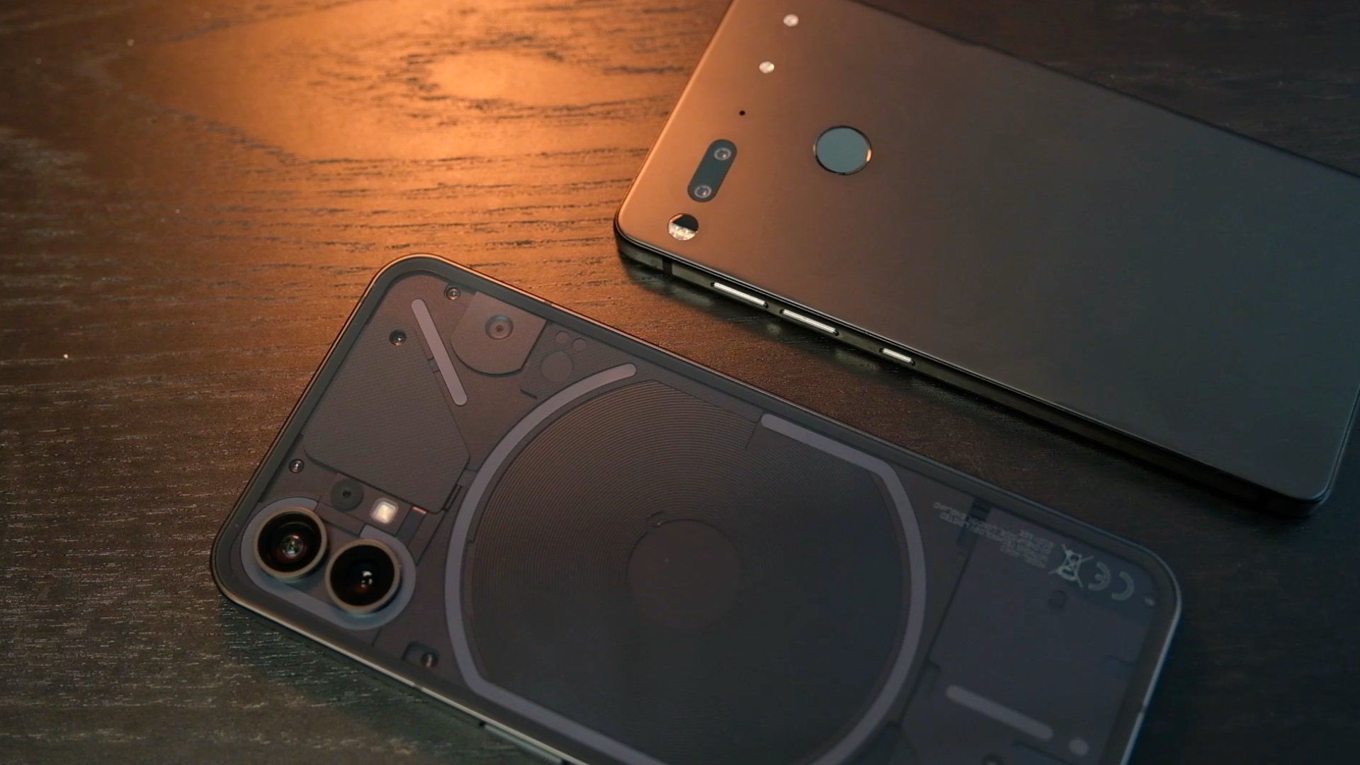
I’ve had my hands on a wide variety of phones over the years. I’ve even reached that point where I come across older devices out in the world and have to ponder to myself why it looks so familiar before realizing, “Oh! I used that phone before!” However, there are some phone designs that you’ll never forget. For new brands trying to break into the industry, having a physical look that stands out could be beneficial. I’ll never forget what the Essential Phone PH1 looked like and now I will never forget what the Nothing Phone (1) looks like. That is by design. In some ways, Nothing is essentially that phone.
The Light Show
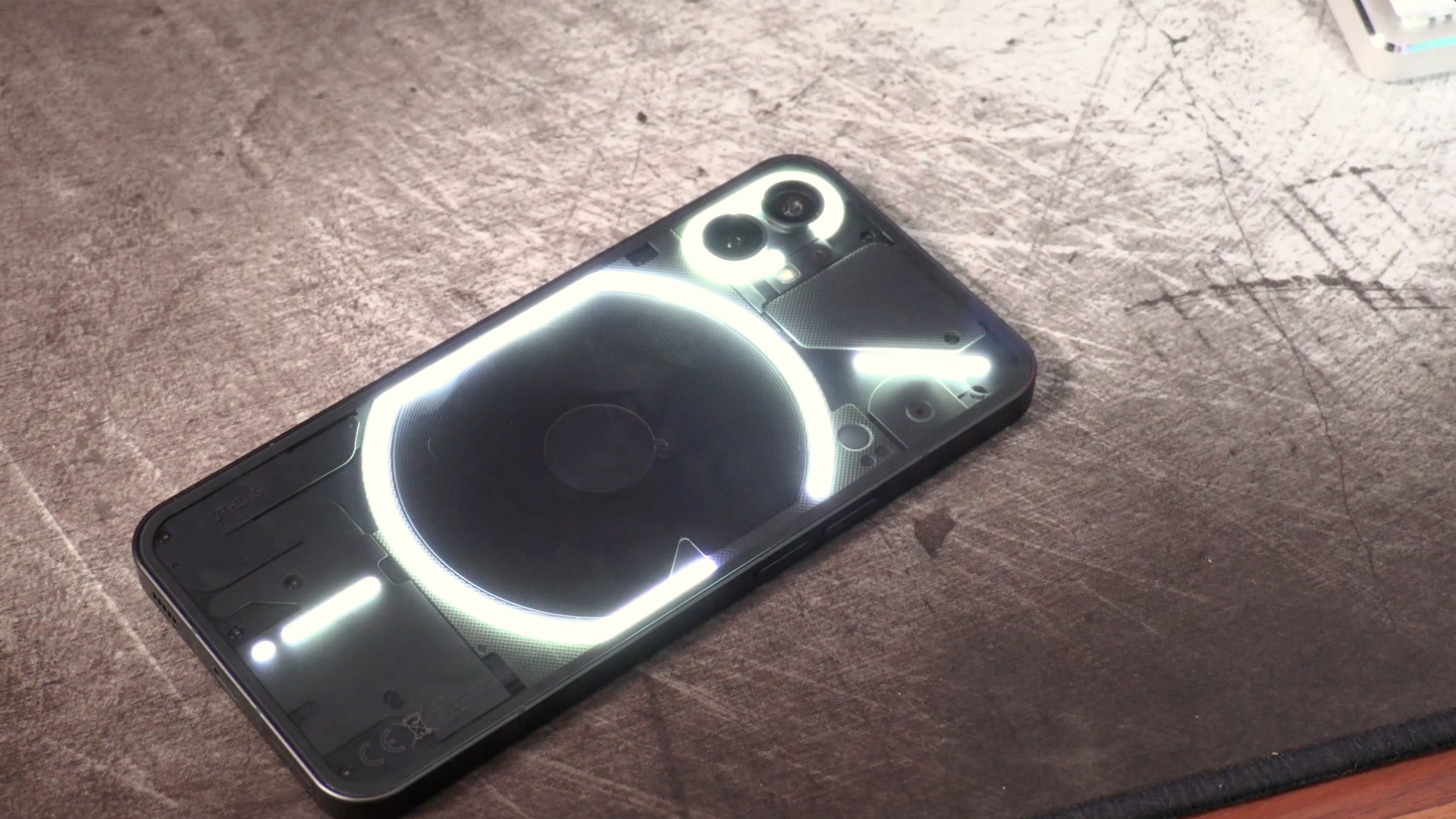
Without a doubt, the uniqueness of Nothing’s first phone falls upon the LED strip on the rear of the phone that is shaped in the form of the company’s logo. For a young company with no prior exposure to any audience, it’s a subtle and smart way to train people to associate an image with a product line. That being said, most general people don’t even know what the Nothing logo looks like in the first place and won’t recognize this correlation. It’s a unique symbol that isn’t too compact, nor has any relatable form for people to associate it with, like say an apple or a leaf. Still, the light show is remarkably eye-catching as I do find phones with exposure into the insides to be appealing. Even if you remove the light factor, the Phone (1) has a classy, business professional appearance that I’d wager can lay on any conference table and it would not look out of place.
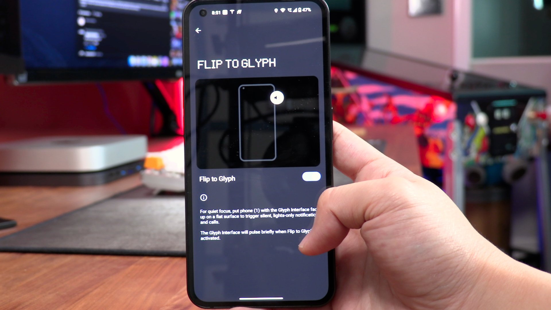
There are a few options to operate the Glyph
If I’m being honest, the lights are a glorified notification LED. In fact, its only real functionality purpose is to tell users when they have an incoming call or a notification. This also means that for the user to see this nifty gimmick, the phone will have to be placed face down on your table. There’s some software integration that Nothing has incorporated to utilize this, like keeping the notification volume silent when you put the phone face down. The phone will only flash the lights as a way to inform its owner of incoming information. After so much time with the phone in my pocket, I eventually just forgot about the LED lights. That’s my true everyday driver user assessment of the lights. It’s as gimmicky as it can get and doesn’t offer anything new from a functionality standpoint to the user. In fact, you don’t even look at that part of the phone 90% of the time as your eyes are locked in on the front screen for content viewing. It’s cool, but ultimately unnecessary. I guess it does get the point across that this is a unique brand not afraid to be different though.
Mid-Tier Specs
Flipping the phone around, the display is quite pleasant to look at. Nothing put in a 6.55”, 1080x 2400p OLED display that hits 402 ppi. With a 20:9 aspect ratio and a 120 Hz refresh rate, this display is pretty comparable to competitors on the market right now. It’s a sharp screen with slightly muted colors, but contains a pretty solid palette of color range that isn’t too overly saturated. The viewing angles are solid from every direction and the phone does provide a great viewing experience. It isn’t special by any means, but it is a terrific display for a mid-ranger.
They’ve also utilized that display with an in-display fingerprint scanner. While I’m not a huge fan of these types of sensors, it does the job well enough for me. It’s not too fast to recognize your thumb, but it seems accurate enough as I have not been locked out, nor has it unlocked my phone without the correct fingerprint. All of this is getting power from a 4,500 mAh battery. I’ve really hammered a lot of tasks for the Nothing Phone to handle and for the most part it has been terrific battery life. It’s reasonable to expect 4-6 hrs of screen on time playing mobile games here. It’ll easily last all day for normal usage. I would put this as one of the better battery performances in the mid-tier range.


Unlike the Google Pixel 6a, which decided to use an older Corning Gorilla Glass 3 screen, Nothing doesn’t skimp out here as they opted for the current product with the Gorilla Glass 5. What they did scale back on is with the processor. Instead of throwing their first phone into the grueling flagship gauntlet, the new company wisely targeted the mid-range segment by using a Qualcomm Snapdragon 778G+ 5G SoC. While this processor won’t set the AnTuTu scoreboard on fire, it is a rather well performing processor based on my day to day tasks. 8 GB or ram and 128 GB of storage support the performance of the company’s Android skin, Nothing OS 1.1.4. Basically all the apps and games I run open in a timely manner and function as well as I would like them to perform. This is a good performing mid-tier phone.
The skin over Android 12 is rather stock-like, with additional settings and slightly modified menus. The ebb and flow of the Nothing skin is fine from a user experience standpoint, but I did run into various bugs that I haven’t encountered on Android in many years. I’ve had a few lockup situations where the phone completely crashed and burned to the point where I was locked out of any controls for 5 minutes. I had to perform a forced hard reset to finally be able to reboot the system. There were also mini-lockups where I would be navigating the OS and nothing responds on the screen for 5-10 seconds. Imagine a huge lag scenario. I’ve come across situations like this on certain phones in the past, but most modern devices from mainstream brands have well developed software optimization by now remedying these issues.
Another issue I had was with call quality. I did find my frequency of dropped calls to be slightly higher in reliable areas than I would have anticipated. This particular model of the Nothing Phone (1) does have the proper bands for solid reception for both call and data with LTE and even 5G with my network. However, it seems to be inconsistent with the quality on a day to day basis.
I also found the Wi-Fi connection to be more limited than some of the other phones I’ve been using. When put side by side with the Pixel 6a and the iPhone 13 Pro on my office desk, the Nothing Phone (1) loses hold of my Wi-Fi signal and remains on 5G or LTE. It sometimes attempts to recoup what it thinks is the stronger signal, but eventually stays on mobile data. This isn’t a big deal to some, but as I mentioned, my Pixel 6a and the iPhone 13 Pro find my Wi-Fi connection to be the stronger signal to hold onto in the same spot as the Nothing Phone (1). I’ve done enough testing at work to believe that a limited range may be a contributor to this. I do recognize that this isn’t a release that quantifies compatibility for a US operator, but on paper, this global phone should work with my network like a Xiaomi or Realme phone would with the same bands. With that in mind, I don’t really hold this as a negative for the phone in this review, but it is something for US buyers to note if they are interested in purchasing it.
Subpar Cameras
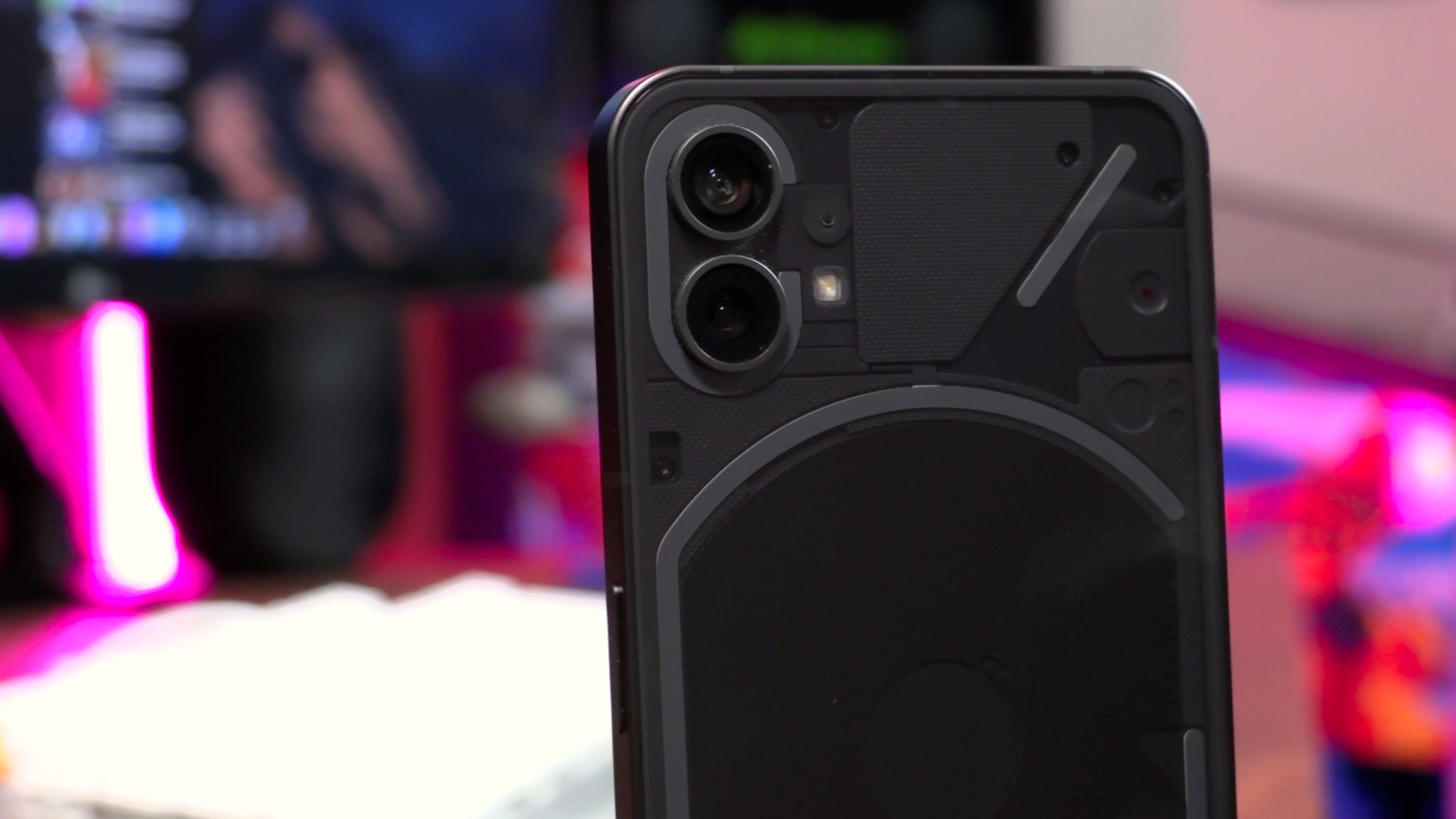
Nothing Phone (1) features dual 50 MP sensors
The biggest roadblock keeping the Nothing Phone (1) from being a viable everyday carry to me are the lackluster photo taking capabilities. I say this in regards to photos as a whole including the use of the camera app which is atrociously slow to launch open. I’ve missed quite a few opportunities at quick snaps of moments waiting for the camera app to load. It doesn’t always open slowly, but the amount of camera app crashes I come across were enough to make a comment about in this review. Camera crashes still happen on any phone, but they happen a bit too frequently along with the slow load times on the Phone (1).
When you combine the laggy camera app with the subpar results from the dual 50 MP sensors, it is a disappointing aspect to this phone that simply needed to just be average. I didn’t come into my review period with the Phone (1) expecting a top tier camera performance, but I think it’s fair to ask for a little bit more than what I saw. For starters, the clarity of the images leaves a bit to be desired. The Nothing Phone (1) struggles to define the focal points of what it should be targeting. This leaves parts of an image that should have been the focal subject blurry. I’ve realized recently just how much we take for granted AI advancement in mobile photography. Every time Google or Apple drops a quote about how much improvement was made in the advancement of their AI for both photo taking and processing, many of us brush over it as it isn’t a sexy hardware spec bump. Using this phone right after the Pixel 6a really hammers some of these things down. Both optimal and low-light scenarios present issues for these cameras. While it isn’t impossible to get a sharp and well framed image on this phone, I found it to be easier to get a shot I personally wasn’t happy with more frequently than one I was.
Taken on the Nothing Phone (1)
Essentially That Phone
This is a good first product that has its share of fixable issues. It deserves to see a second iteration.
Now that I think of it, the Nothing Phone (1) shares a lot more in common with the Essential Phone PH1 than just a distinct appearance and clean software. A lot of the core experiences I had with this phone aligned with my time with that phone. I loved the stock feeling of the Essential Phone and the Nothing Phone has a similar vibe. I essentially stopped pulling out my Essential Phone to take pictures because the camera results were just that bad. While the Nothing Phone isn’t quite at that level of dreadfulness, once again, I have similar negative feelings towards this camera. Both of the phones are also devices that random people will constantly ask you what it is and have no idea about the company when you tell them about it.
I see a lot of the Essential Phone PH1 in the Nothing Phone (1) and I know for certain, the enthusiasts who enjoyed using that phone will want to get their hands on this unique device. Hopefully Nothing, the company, doesn’t share the same fate as Andy Rubin’s brand which they acquired the rights to last year. The tech world does need innovation and mass consumer products that dare to be bold. This is a good first product that has its share of fixable issues. It deserves to see a second iteration. That’s where I really believe we’ll be able to get a feel of what this wacky mix of OnePlus and Essential can truly be.
Nothing Phone (1) (Left) and Essential Phone PH1 (Right)








Alex
Caught in between the conundrum of his fascination with retro and the future, Alex has a very unique taste in technology. Never one to follow trends like his millennial peers yet constantly desiring to get ahead of the curve, he sees technology like he does his other love: comic books. Always looking for the best value or a hidden gem, his collector mindset reflects on some of his favorite gadgets: the Moto X (2015), HTC U11 and the Google Pixelbook. If there’s a good tech deal out there, Alex is on the hunt!